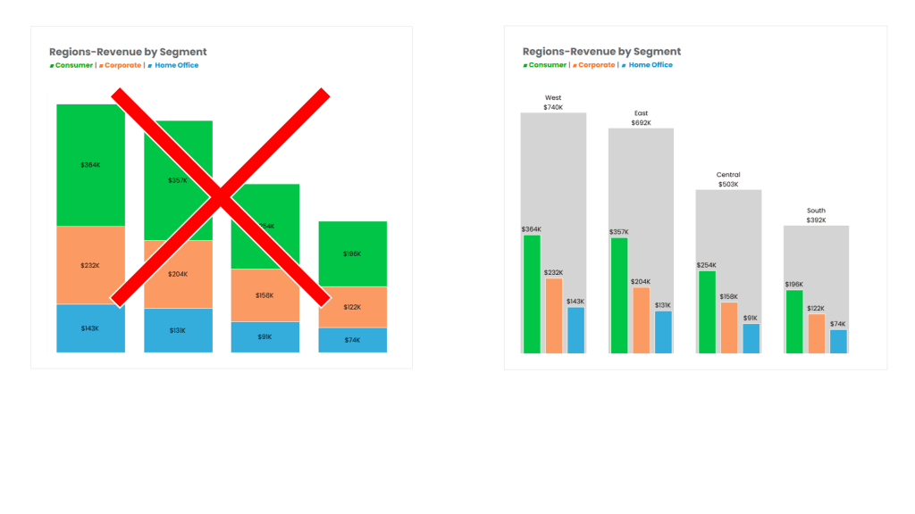
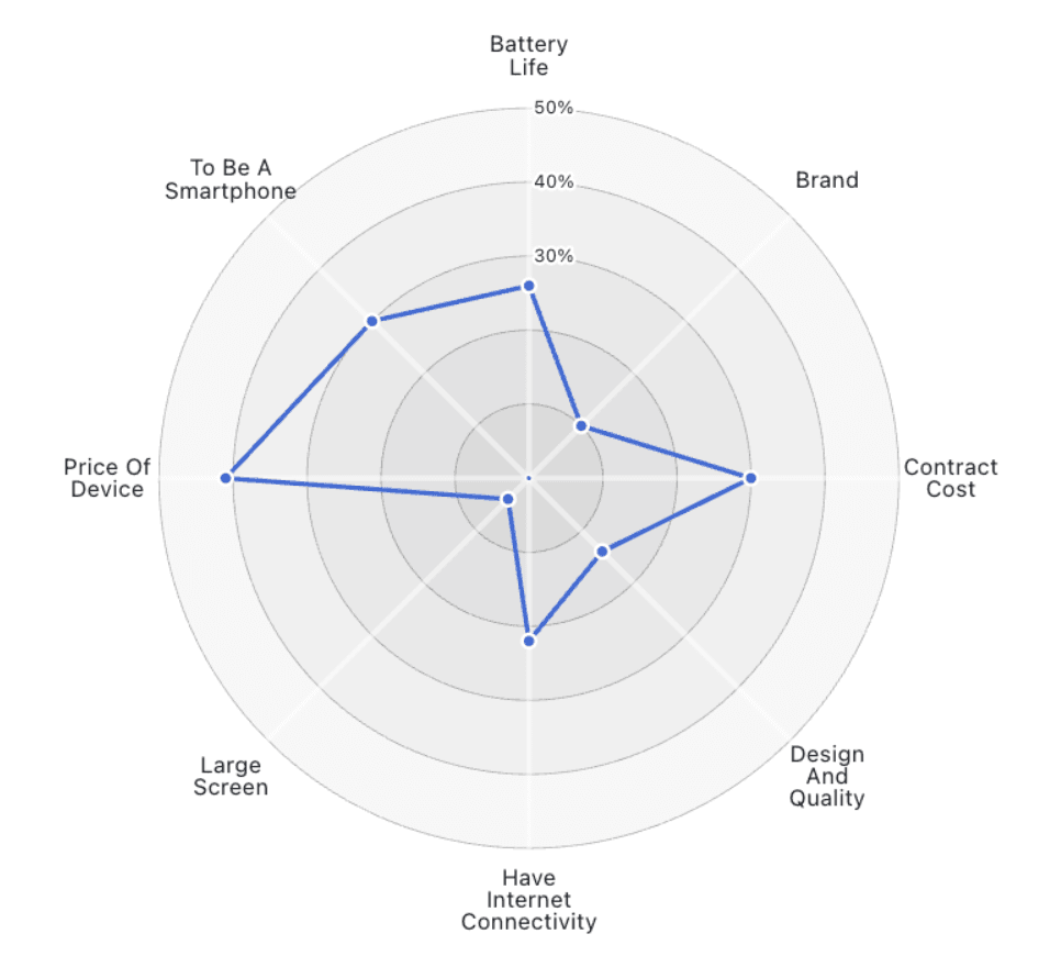
Custom Formatting
This article, by Jim Dehner, is one you shouldn’t miss. His post breaks down the often-overlooked details of formatting – providing tips that can instantly make your visualisations more polished…
Jennifer Dawes shares a personal narrative about the profound impact of collaborating with industry leaders in the Tableau community. Through her experiences, you’ll discover how working alongside Tableau elites not
Life with Visionaries: How Working with Tableau Elite Shaped My Data Career Read More »
Andy Kriebel’s post introduces the comet chart – a visually striking and effective way to represent trends over time. Unlike traditional charts, comet charts provide a unique perspective by combining
Dawn Harrington’s post uncovers the many advantages of dot strip plots, which are powerful tools for displaying data distributions and revealing underlying patterns in a clear and concise manner. She
In this article, Garrett Sauls and Sarah Dorfman share expertise on the intricacies of migrating to Tableau Cloud – detailing the strategic advantages it can offer to organisations looking to
InterWorks LA and Tableau Cloud Migration with Sarah Dorfman Read More »
If you’re passionate about data visualisation and eager to stay ahead of the curve, Alexander Waleczek’s post is a must-read. He explores the exciting innovations on the horizon for Tableau
Here, Jennifer Dawes dives into how Tableau can transform raw data into meaningful, visually-compelling narratives that engage and inform. It offers practical techniques for turning complex datasets into clear and
Data Visualization: Transforming Raw Data into Insightful Stories with Tableau Read More »
Whether you’re looking to streamline your processes, improve the visual appeal of your data, or learn new shortcuts, this post by Dawn Harrington, featuring Lindsay Poulter, provides practical tips that
The Lindsey Poulter Method and Other Tableau Tips Read More »
Understanding the granularity of your data is a key concept that can make or break the effectiveness of your analysis, and here, Ariana Cukier’s article, provides an insightful look into
Why It’s Important to Understand the Granularity of Data Read More »
If you’re passionate about data visualisation and want to ensure your Tableau dashboards are accessible to everyone, the piece, by Rafael Simancas, highlights the critical importance of accessibility in design
Fundamentals of Accessibility Design: Making Your Dashboards a Friendlier Place Read More »