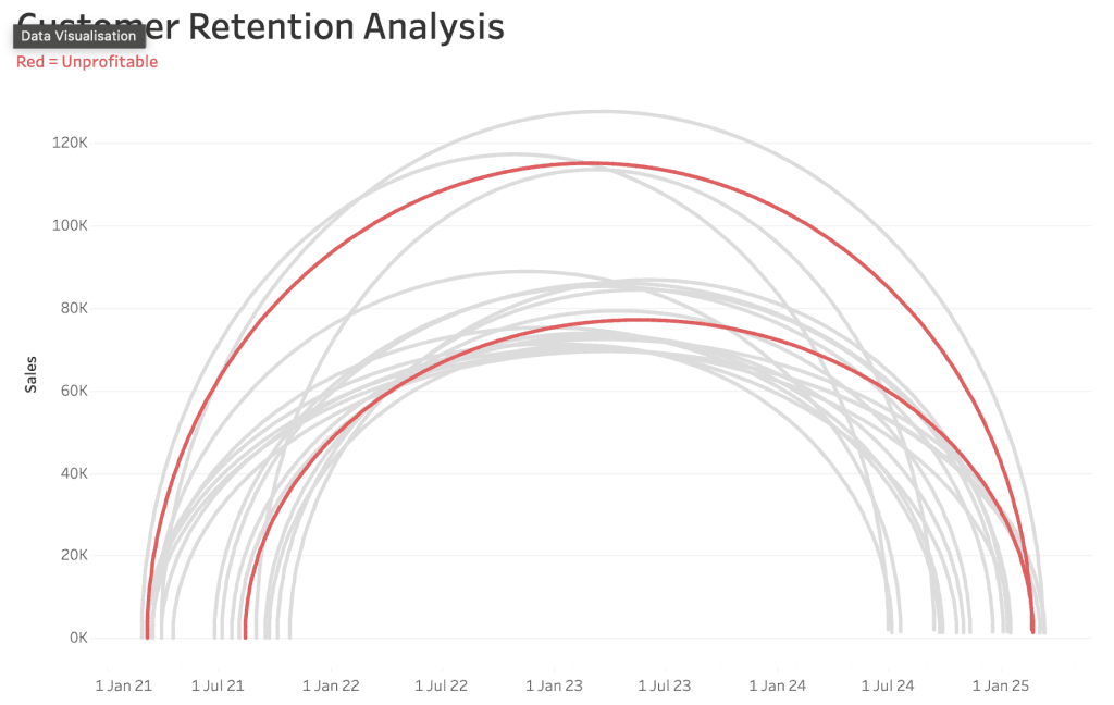
How to Create a Win/Loss Sparkline
If you’re looking to add a powerful and visually-compelling tool to your Tableau repertoire, Andy Kriebel‘s post walks you through the process of creating win-loss charts – a highly effective…
Dawn Harrington shows us how to create and use custom blank shapes with TechSmith’s SnagIt. SnagIt is an incredibly versatile tool that’s not just for screen recordings but can also
If you’re looking to take your Tableau dashboards to the next level, Uday Gundu provides a fresh perspective on how to combine the power of Tableau’s data capabilities with thoughtful
Data Meets Design: Exploring Tableau for Stunning, Insightful Dashboards Read More »
This insightful guide, with Lyndsay Betzendahl, introduces an effective method for creating multi-filter buttons that allow users to control several filters at once, all with a single click. Instead of
This insightful guide by Ann Pregler outlines a step-by-step process for reviewing a dashboard – from assessing data sources to understanding filters and calculations. She provides clear and actionable advice
This post with Alan Wilson dives into how one of the world’s leading companies leverages clean, impactful design to transform data into compelling narratives. From dashboards to presentations, Kraft Heinz
Andy Kriebel’s post is a masterclass in efficiency and simplicity. In his guide, he demonstrates how to streamline your dashboard-building process without sacrificing quality or clarity. It’s a must-read for
Build an interactive Tableau dashboard in 3 minutes! Read More »
Imagine receiving the latest Tableau insights directly in your email inbox without ever needing to open the Tableau dashboard. Jules Claeys’ post shows you exactly how to make this a
If you’re looking to create Tableau dashboards that are not only powerful but also easy to maintain, Ann Pregler shares valuable strategies for designing dashboards that are intuitive to use
If you’ve ever wondered how data visualisation can transcend traditional analysis and become a form of creative expression, the Tableau Data Art Gallery is the perfect place to explore this
Announcing the Tableau Data Art Gallery: A Celebration of Creative Expression Read More »