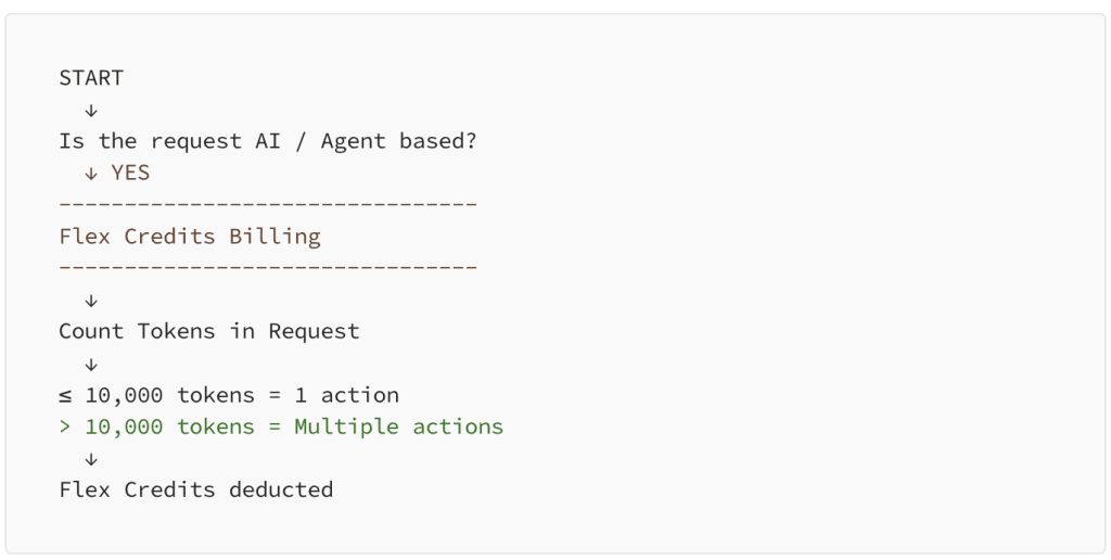
Avoiding Common Pitfalls in Chart Design
This insightful article, by Alyssa Huff, helps you understand how even the simplest design choices can lead to confusion or misinterpretation of your data. She offers practical advice on creating…
Cycle plots are perfect for displaying trends within cyclical data, like seasonal sales or recurring events, making them a powerful tool to spot patterns that might otherwise go unnoticed. This
How to Make Your Cycle Plots Actionable in Tableau Read More »
Collaboration is the heart of innovation in data visualisation, and this post, with Jennifer Dawes explores exactly why this is so essential. It highlights the importance of shared learning in
The Power of Collaboration in Data Visualization: Why Tableau Thrives on Shared Learning Read More »
If you’re looking to enhance your project management visualisations, this article, with Dawn Harrington, offers advanced tips on how to take Gantt charts beyond the basics – turning them into
If you’re a visual analytics architect or designer looking to boost the effectiveness of your work, Conor Caldwell’s post contains strategies for improving how you communicate with stakeholders, so that
Collaborative Communication Tips for Visual Analytics Architects (Designers) Read More »
Andy Kriebel’s post shows us the various chart types available – offering practical insights into when and why to use each one. From bar charts to heat maps, the article
Here, Kartikaya Srivastava shares his personal journey of blending data with narrative in Tableau – highlighting the creative and technical decisions that shape a compelling story. Gain insights into how
My First Attempt at Visual Storytelling in Tableau Read More »
This informative piece, by Kate Strachyni, featuring Southard Jones, dives into the enhancements that have been rolled out – showcasing features designed to improve user experience and streamline data analysis.
Dive into the fascinating world of data leadership with Karthik Palanivel‘s journey. He shares his unique experiences and insights -illustrating the pivotal moments that shaped his career in data. From
Level up your Tableau expertise with Kevin Flerlage and this treasure trove of invaluable insights. He dives into practical tips and creative techniques that can transform how you approach data