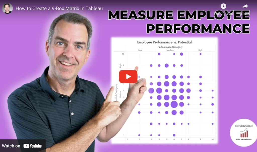
How to Create a 9-Box Matrix in Tableau
Andy Kriebel’s video tutorial makes it easy to implement this powerful visualisation, even if you’re new to the concept. Through clear instructions, he explains how to build and customise the…
Andy Kriebel’s video tutorial makes it easy to implement this powerful visualisation, even if you’re new to the concept. Through clear instructions, he explains how to build and customise the…
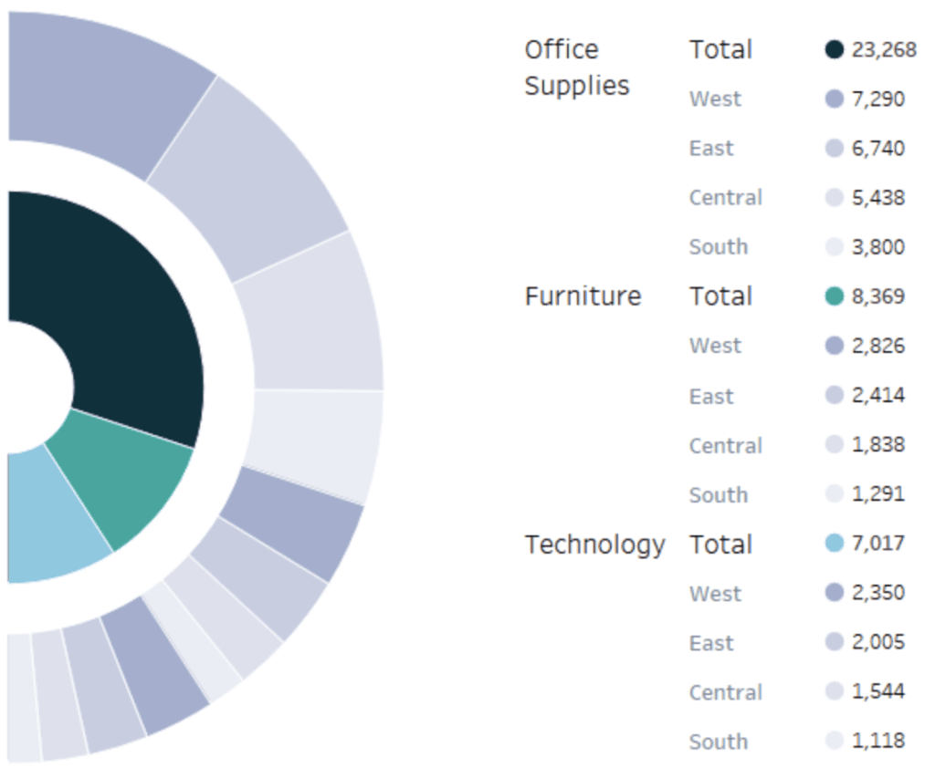
Felicia Styer’s tutorial introduces a dynamic way to display hierarchical data. Semi-sunburst charts are especially effective for showing relationships within layered data – such as organisational structures or category breakdowns.
Here’s a great post with Yvette Kovács sharing simple, yet impactful tips that can make a world of difference in your Tableau experience. Her tips are designed to streamline workflows,
Here, Jennifer Dawes shares her personal experiences from this high-stakes competition – highlighting the creativity, commitment, and resilience needed to excel. Through her storytelling, you’ll get an insider’s perspective on
Reflecting on My Tableau Iron Viz Journey: Lessons Learned and New Directions Read More »

If you’re looking to add more interactivity and precision to your Tableau dashboards, Brenda Dorianny Chavez’s tutorial is the perfect resource by adding a level of customisation that not only

If you’re eager to elevate the interactivity of your Tableau dashboards, this video post by Andy Kriebel is essential reading. It walks us through a clever technique that enables users
How to Simultaneously Highlight & Deselect with a Parameter Action in Tableau Read More »
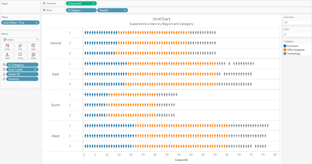
Thiago Santos’ guide breaks down what can seem like a complex visualisation technique into easy-to-follow steps – helping you understand both the “how” and “why” behind dynamic unit charts. Perfect
How to Create Dynamic Unit Charts in Tableau Desktop: A Step-by-Step Guide Read More »

If you want to refine your data visualisation skills, here’s an essential read on the InTheBlack page – highlighting common errors that can undermine the effectiveness of your visual presentations,
5 mistakes you’re making with data visualisations Read More »

This insightful piece, by Kevin Flerlage, dives into the nuances of these interactive features – highlighting how they can enhance user engagement and improve the overall experience of your dashboards.
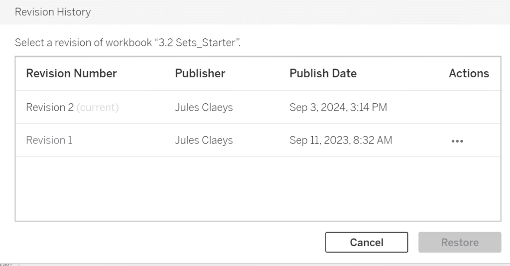
Jules Claeys walks you through the steps to access and manage revision histories effectively – making it easier to navigate updates and maintain the integrity of your visualisations. Whether you’re
