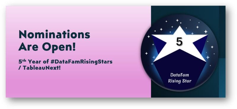
Let’s Talk About Dates Baby!
Dive into this post with Dawn Harrington (TechTipsGirl) as she talks us through this often-overlooked topic. She offers practical advice on how to enhance your dashboards by allowing users to…
This guide by Felicia Styer and Juan Carlos Guzman is the perfect place to start. Their tutorial dives into how you can give your users the ability to make multiple
If you’re eager to take your data visualisation skills to the next level, this post, by Andy Kriebel is an excellent resource to explore. It delves into the concept of
This article covers various techniques to manage large and complex data sources efficiently – helping you streamline your analysis and create more impactful visualisations. By applying the insights shared in
Boost Your Tableau Workbooks With Large and Complex Data Sources Read More »
Here, Jennifer Dawes explores the essential role that feedback plays in the visualisation process – emphasising how constructive criticism can help you refine your work and make it more impactful.
The Art of Feedback in Data Visualization: What Works and What Doesn’t Read More »
This piece, by Thomas Nahn and Lari McEdward, delves into the intricacies of working with multi-fact relationships, which can significantly enhance your data visualisations by allowing you to analyse multiple
When and How to Use Multi-fact Relationships in Tableau Read More »
This post, by Lindsay Betzendhal, breaks down a clever technique to emphasise the ends of your bars – making key data points stand out more effectively. You could be presenting
This article, by the guys over at Tableau, provides an all-encompassing guide to the most powerful and essential features in Tableau – helping users at every skill level improve their
This insightful post with Steve Wexler breaks down the art of transforming raw data into powerful visuals that communicate complex information in an easily digestible way – helping you explain
This article, by Jim Dehner, is one you shouldn’t miss. His post breaks down the often-overlooked details of formatting – providing tips that can instantly make your visualisations more polished