Top 10 Qualifiers for Iron Viz 2026
Here’s a chance to draw inspiration from some of the most creative data work being done today. Each qualifier entry reflects its author’s unique perspective, research, and design choices, offering…
Here’s a chance to draw inspiration from some of the most creative data work being done today. Each qualifier entry reflects its author’s unique perspective, research, and design choices, offering…
Watching this episode with David Lou and Matthew Miller, lets you tap into technical tips, inspiring use cases, and fresh perspectives that you might otherwise miss if you weren’t at
Tableau Roadmap: Innovating Across a Unified Platform Read More »
Lindsay Betzendahl’s post empowers you to work smarter, not harder – showing how to expand your dashboard’s layout container hierarchy quickly (using a neat SHIFT+8 trick), reuse pre-formatted containers to

Johan de Groot doesn’t just explain the problem; he gives you concrete, actionable workarounds to improve your dashboards without sacrificing accuracy. Whether you’re dealing with huge datasets or just want
Serena Purslow‘s guide is concise and beginner-friendly, making it easy to implement this function in your own dashboards. She shows you through creating a calculated field and applying the CEILING()
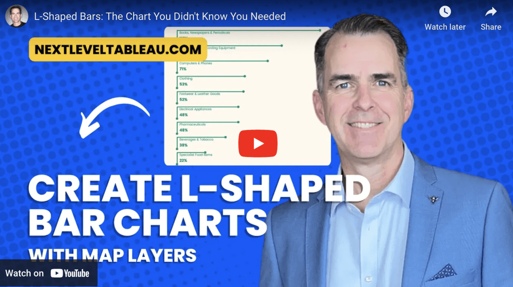
In this tutorial from Andy Kriebel, you’ll learn how to build this unique chart type, which blends elements of bar charts and line graphs. Unlike traditional bar charts, L-shaped bars
L-Shaped Bars: The Chart You Didn’t Know You Needed Read More »
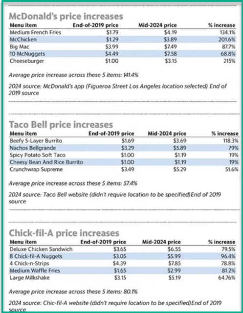
If you want to clearly communicate price increases in your dashboards, this article from Dawn Harrington’s guide explores the best visualisation techniques – from bar charts with reference lines to
What is the Best Way to Show a Price Increase in a Dashboard? Read More »
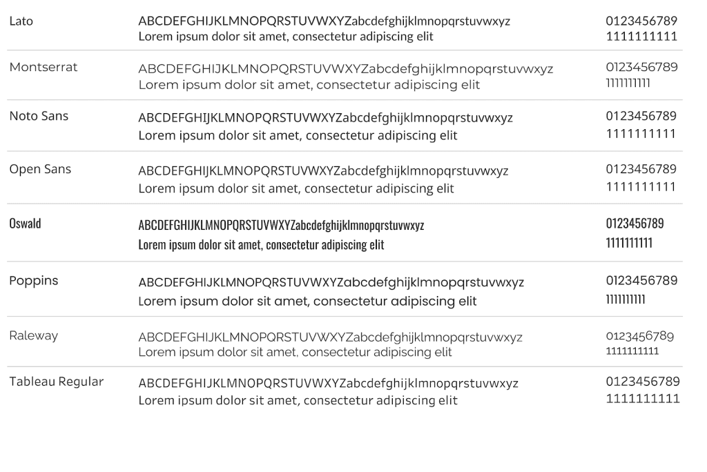
Choosing the right font for your visualisations is crucial, not just for aesthetics but also for ensuring consistency across devices and browsers. This post (with Ken Flerlage) covers which fonts
Brittany Rosenau’s post is insightful guide demonstrating how to transform ordinary bar charts into visually-captivating and engaging data visualisations. She shares step-by-step techniques to add flair to your charts while
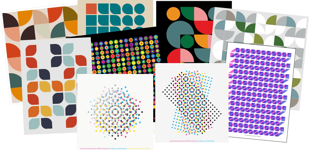
If you’ve ever wondered how data visualisation can transcend traditional analysis and become a form of creative expression, the Tableau Data Art Gallery is the perfect place to explore this
Announcing the Tableau Data Art Gallery: A Celebration of Creative Expression Read More »
