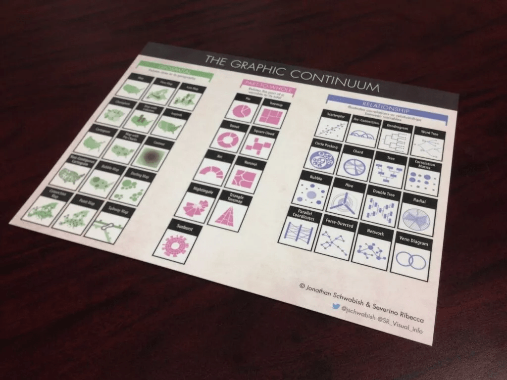
Are you looking to improve your chart literacy? Jonathan Schwabish and Severino Ribecca have created the Graphic Continuum, a tool that helps bridge the gap between complex information and simple visuals. In this post, by Michael Sandberg, we explore how it can help you better understand data visualisation.
The Graphic Continuum is an incredibly useful resource for anyone looking to learn more about data visualisation. It provides a comprehensive overview of different types of charts, from distribution to time-series, and offers guidance on which chart is best suited for each type of data.


