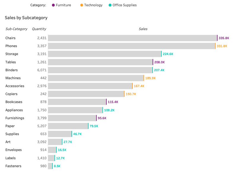
If you want to make your Tableau visualisations more dynamic and impactful, this post, by Lindsay Betzendahl is a great place to start. She walks you through how to colour the ends of a bar chart – adding a subtle but powerful enhancement to your data storytelling. This technique not only draws attention to key values but also helps clarify trends and outliers in your visualisations.
What makes this post so valuable is how practical and accessible the technique is. You don’t need to be an advanced Tableau user to implement this feature, and it can make a big difference in how your audience perceives the data. By adding visual emphasis to important data points, you can convey insights more effectively and elevate the overall design of your reports.


