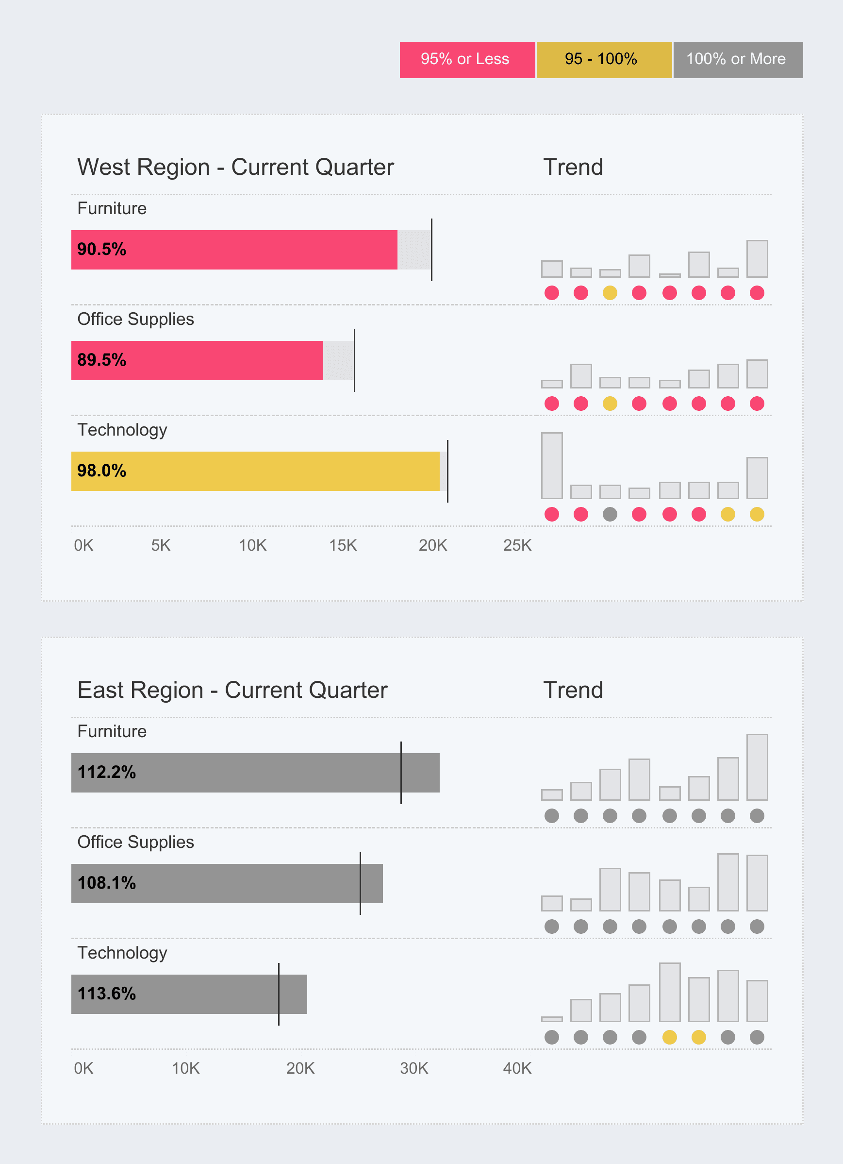
Elevate your data visualisation skills – especially in presenting “Actuals vs. Target” comparisons, with this blog post from Kevin Flerlage. He breaks down the process of designing these charts in Tableau – offering clear, actionable steps that make it easy to create visuals that communicate your data’s story effectively. His approach makes even complex techniques accessible – helping you design charts that are both visually striking and informative.
What sets this guide apart is the focus on making your data compelling while ensuring it remains easy to interpret. You’ll learn how to enhance your dashboards by highlighting performance insights in a way that truly engages your audience. Refine your visualisation skills—dive into this tutorial and start creating impactful, professional-grade charts today!


