Today, I’m talking information overload and how it can make or break your data storytelling.
Understand Cognitive Load
Cognitive load refers to the amount of mental effort required to process information. In the realm of visual analytics, this translates into how easily and quickly a viewer can understand what’s being presented without feeling overwhelmed.
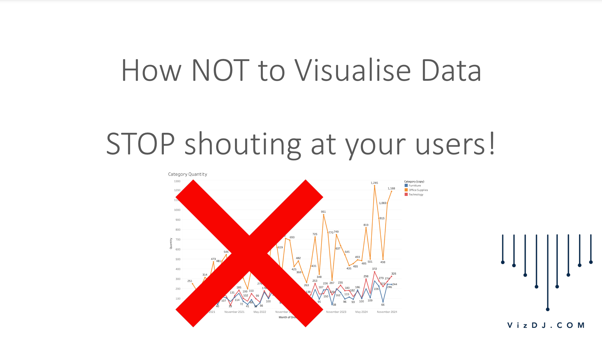
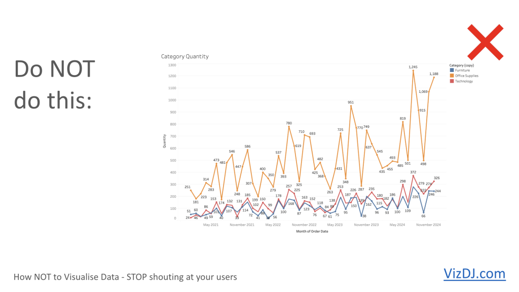
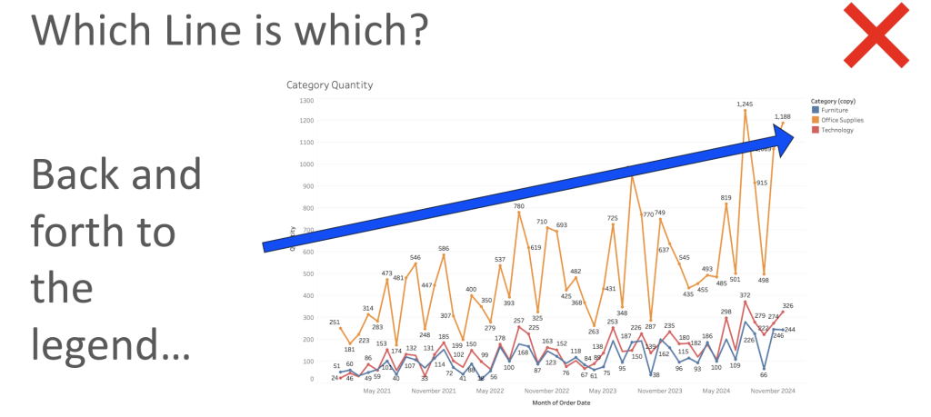
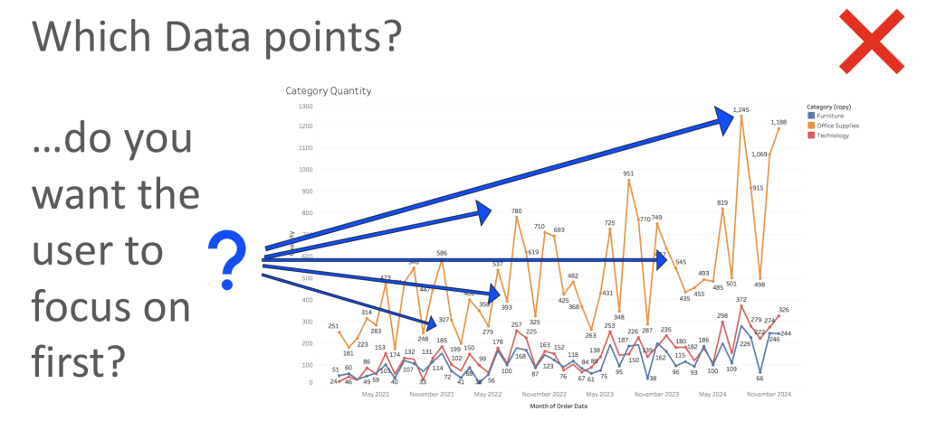
The chart below is a vibrant explosion of colours with orange, red, and blue lines tracking three different categories over four years. Each month is meticulously labeled, demanding that viewers match colours to a legend to understand what they’re seeing. It’s like a party where everyone’s shouting at the same time to be heard—you might catch bits of interesting conversations, but it’s mostly just overwhelming.
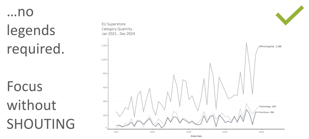
The next chart takes a more minimalist approach. It uses three shades of grey to differentiate the categories, and only the most recent data point is labeled, incorporating the category name. This chart is like a well-moderated panel discussion where each speaker takes a turn, making it much easier to follow along.
Less is More
The second chart isn’t just easier on the eyes; it’s a prime example of reducing cognitive load through effective design. By limiting the use of labels and colour and focusing on the latest data points, the chart allows viewers to grasp the trends at a glance without unnecessary distractions. It’s about making the data accessible and understandable, not showing off every feature at your disposal.
Key Takeaways to Reduce Cognitive Load
1. Simplify the Colour Palette:
Use colour purposefully. Reserve bright or varied colors for highlighting critical elements of your data. When in doubt, shades of a single colour can convey your message effectively without the sensory overload.
2. Label Strategically:
Labels are your friends, but like any good friendship, they need boundaries. Overlabelling can clutter your visualisation and confuse your audience. Instead, label key data points or trends that serve your narrative.
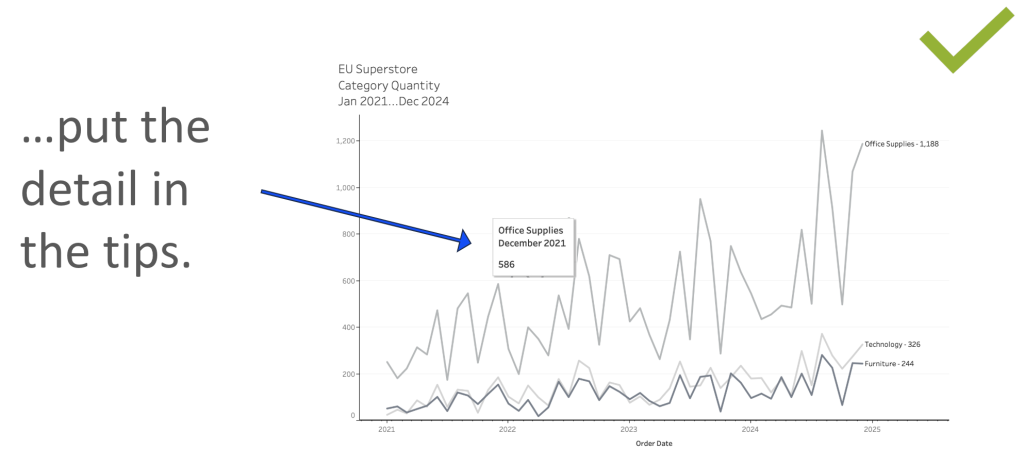
3. Use Direct Labelling:
Whenever possible, integrate labels directly into your data points. This removes the need for a legend and keeps your audience’s focus on the data itself, not on deciphering your chart.
4. Focus on Clarity:
Before finalising a visualisation, step back and ask yourself: “Can someone unfamiliar with this data understand this chart quickly?” If not, it might be time to simplify.
By focusing on reducing cognitive load, you not only make your charts cleaner and more professional but also more impactful.
The Loudest Person in the room, is rarely the most interesting…


