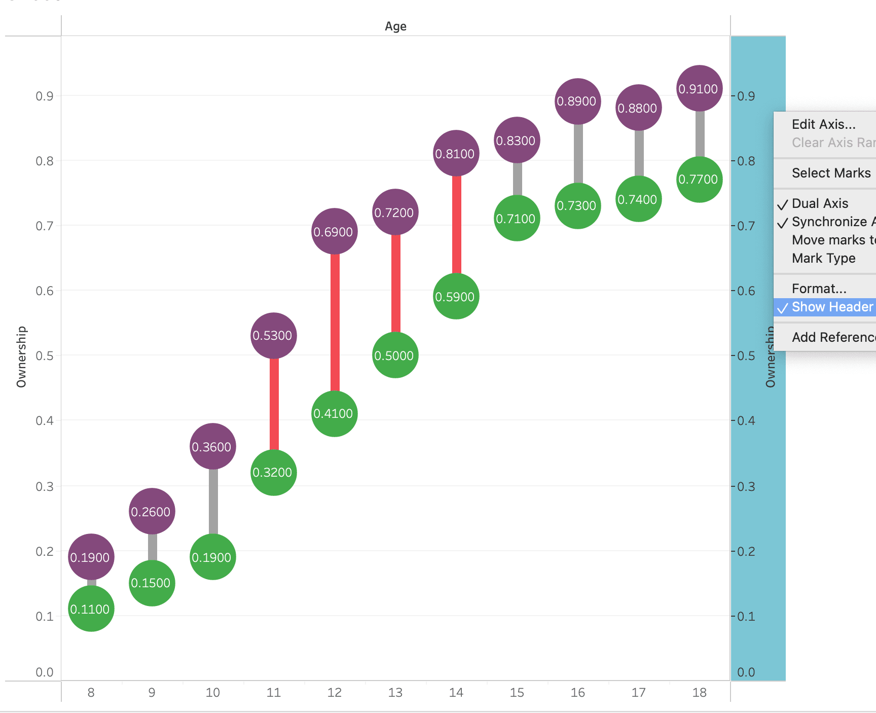
This engaging tutorial, by Thomas Duong, introduces you to the dumbbell chart – breaking down the creation process step-by-step – making it accessible for anyone, whether you’re a beginner in Tableau or looking to refine your skills. By learning how to create this type of chart, you’ll be able to present your data in a clear and visually-appealing way that highlights key differences and trends.
Thomas not only explains how to build the dumbbell chart but also discusses its advantages in data storytelling – helping you understand when and why to use this visualisation method. The insights you gain from this post can significantly enhance your ability to communicate data effectively – making your analyses more compelling for your audience.


