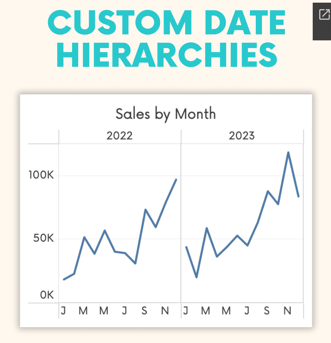
This post, by Andy Kriebel, breaks down how to go beyond the standard date groupings in Tableau, allowing you to tailor drill-down paths, such as Year-to-Quarter or Year-to-Month, giving you greater control over your data presentation. This feature can make your dashboards more dynamic and user-friendly, helping you get the most out of your data.
By customising date hierarchies, you enable deeper, more intuitive exploration of time-based data – equipping you with the skills to enhance your visualisations.


