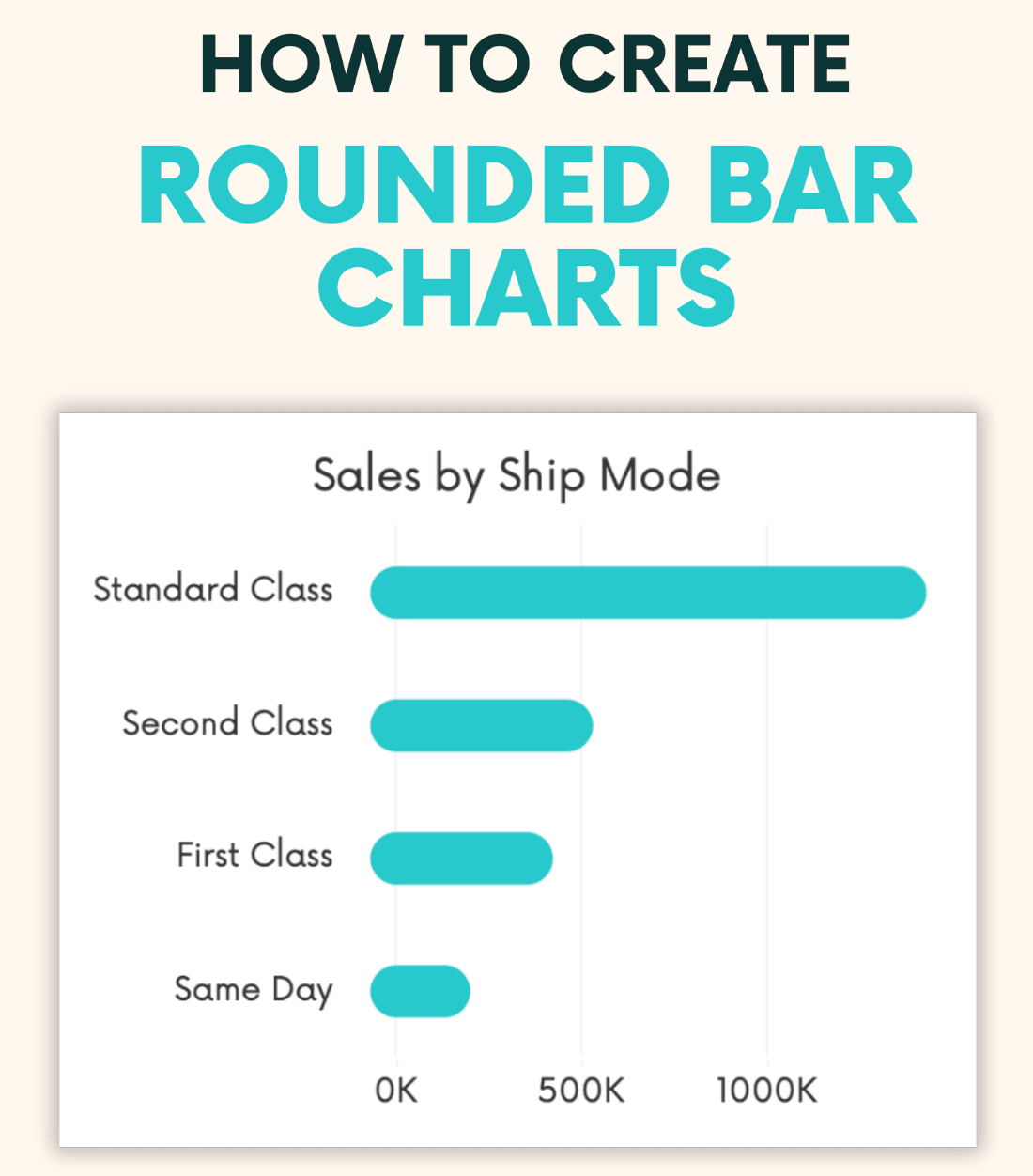
If you’re looking to bring a fresh, modern twist to your Tableau visualisations, check out this post, by Andy Kriebel. Traditional bar charts are effective, but this guide shows you how to give them a polished and unique look by rounding the edges. Rounded bar charts not only add a touch of style to your dashboards, but they also help make your data more visually engaging. It’s a simple tweak with a big impact that can elevate the overall design of your reports.
Beyond just aesthetics, rounded bar charts help to soften the visual presentation, making data easier to consume and more appealing to your audience. Whether you’re presenting to clients, colleagues, or stakeholders, this technique can help your insights stand out in a creative way while maintaining clarity and professionalism. Don’t miss out on learning this valuable skill – it could be just the touch your next Tableau project needs!


