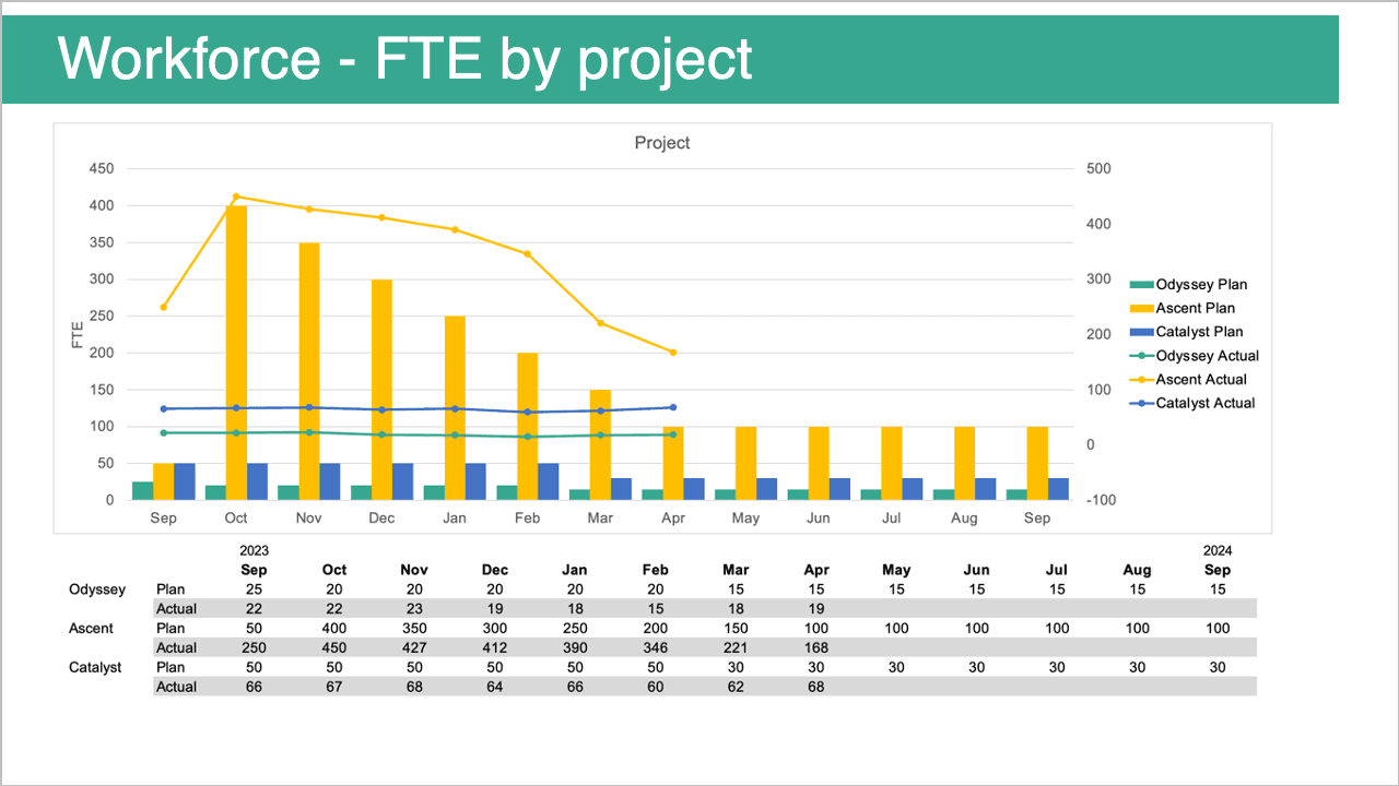
This post, by Amy Esselman addresses the critical question of whether your point is clear when you’re presenting data. It offers actionable insights into how to design visualisations that not only look good but also communicate your message effectively. You’ll learn how to eliminate clutter, focus attention on key insights, and ensure your audience understands the story your data is telling.
What sets this post apart is its focus on clarity and impact. Too often, important messages get lost in overly complex charts or unclear designs. This article helps you avoid those pitfalls by teaching you how to streamline your visuals and make your point stand out. If you’ve ever struggled to communicate your data-driven insights clearly, this post offers the perfect solution to refine your approach. Read on today!


