Why teaching users is the shortcut to better dashboards
Most people treat “shipping the dashboard” like crossing the finish line.
It’s not.
It’s the start of something far more valuable:
A feedback loop that improves your product, your user, and your impact – at the same time.
We call it The Feedback Multiplier.
And it starts with a simple shift in mindset:
Always be teaching.
Teaching improves feedback. Feedback improves dashboards.
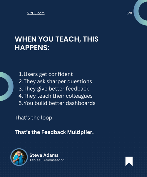
Here’s the loop:
- You teach someone how to use a dashboard
- They use it with more confidence
- They give more useful feedback
- That feedback improves the product
- The next dashboard you build? Easier. Clearer. Better.
That’s the Feedback Multiplier.
And then, get those users to teach their colleagues how to use the dashboard to scale out the process.
It’s not just anecdotal.
📚 Cognitive science calls this the “protégé effect.”
People retain and apply knowledge better when they expect to teach it – or be tested on it.
(See: Nestojko et al., 2014 – Expecting to teach enhances learning and organization of knowledge…)
But you don’t need a research paper to prove it.
You’ve seen it in the wild.
Ever watched someone explain a dashboard to a colleague? They spot their own blind spots. They gain clarity just by walking through it.
This belongs in “Quality Confidence”
In the Powerful Dashboards framework, our final phase is Quality Confidence.
And the last step of that phase?
MVP Published.
You’ve launched a usable version. Now you need feedback.
But here’s the catch:
You won’t get quality feedback unless people know how to use what you gave them.
🚨 This is where most dashboard projects stall. Not because of poor design – but because users were left to figure it out alone.
If they’re confused, they won’t ask for improvements.
They’ll quietly revert to spreadsheets. Or worse – guesswork.
So if you want a real MVP feedback cycle, your job isn’t just to deliver.
It’s to guide.
What does teaching look like?
It’s not formal. And it’s not a time drain.
It’s built into the way you present, hand over, and support your dashboards.
Here’s how:
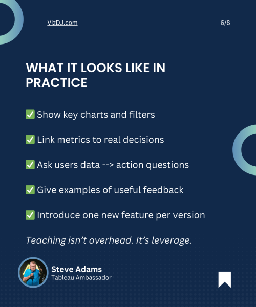
1. Show what matters
Do a 3-minute walkthrough.
Highlight filters, key charts, and what each view supports.
Keep it high-trust, low-jargon.
Why this matters:
🧠 Cognitive Load During Problem Solving: Effects on Learning (Sweller, 1988) shows that simplified guidance helps users process and retain information better.
(Review article: Here)
2. Link charts to choices
Ask:
“What would you do if this metric dropped?”
“Who should know if this trend continues?”
Get them thinking about real actions – not just observations.
Why this matters:
🚀 Decision-based learning improves retention and engagement. It’s a cornerstone of data storytelling and effective analytics translation.
(See: Brent Dykes, Effective Data Storytelling)
3. Teach what good feedback sounds like
Set expectations.
Instead of “It looks fine,” prompt:
- “I expected to see X but I saw Y.”
- “This metric confuses me.”
- “Could we group this by region?”
Why this matters:
🔁 Structured feedback frameworks lead to more actionable, targeted improvements. This principle is echoed in design sprints, agile retros, and peer-review cycles.
4. Teach one new thing per version
Don’t overwhelm users with every feature in one go.
Introduce tooltips, filters, or new layouts gradually – then let them settle.
Why this matters:
📚 Spaced learning improves knowledge transfer and avoids overload.
(See: Ebbinghaus Forgetting Curve and microlearning literature)
Why this creates the win-win-win
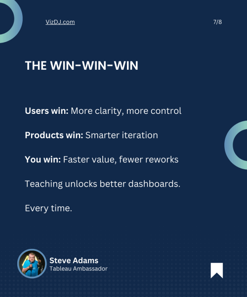
Users win
They feel more capable. Less intimidated. More in control.
Products win
Feedback gets more precise. Improvements become more strategic. Less guesswork.
You win
Fewer frustrating reworks. Faster iteration. More trust.
The result?
✅ Better dashboards
✅ Better decisions
✅ Better data culture
Final thought
Teaching isn’t extra work.
It’s the shortcut.
If you want to build great dashboards, build better users.
If you want better feedback, show people how to give it.
If you want trust, earn it by guiding – not just delivering.
That’s the Feedback Multiplier.
So yes – always be learning. But if you build dashboards for other people? Always be teaching.
Interested in joining my intimate Tableau Insights Community? We have training workshops, coaching sessions, troubleshooting and a community to cover every aspect of building Powerful Dashboards that are Easy to Understand, Easy to Use and Easy to Build – making your contribution invaluable to your organisation.
Review here to see if we are currently taking newcomers or join the waitlist.
This article was featured in Tableau’s Weekly Roundup.

