Rather than focusing only on accuracy or aesthetics, this article pushes you to think about impact: who is represented, how comparisons are framed, and what message the audience walks away with. For anyone working with data, this is a crucial perspective. If you want your visualisations to be not just clear, but ethical and meaningful, read on with Eli Holder.
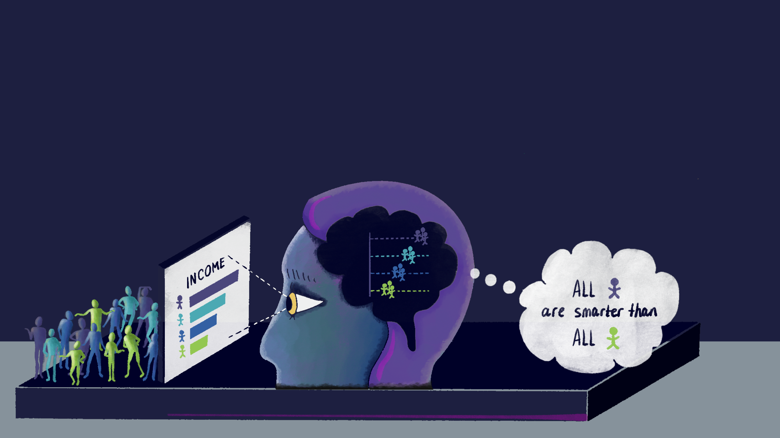

Tableau Training on
Tap Fast Track

Tableau Advanced Analyst

Tableau
Foundation

