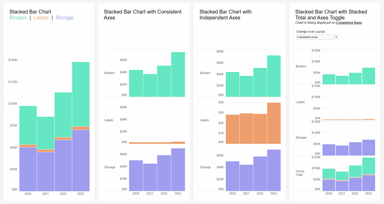
If you’re looking to elevate the interactivity and flexibility of your Tableau dashboards, Kevin Flerlage’s post introduces a clever technique for adding a user toggle that allows your audience to switch between consistent or independent axes in your visualisations. With this feature, you give users the power to decide how they want to compare data – whether they need consistent axes for clarity or independent axes to capture the nuances between different data points. This not only enhances the user experience but also brings more versatility to your dashboards, allowing you to cater to varying analytical needs.
Kevin’s step-by-step approach makes it easy to follow along and implement this technique in your own projects. The Flerlage Twins are known for breaking down complex Tableau features into manageable, actionable tips, and this post is no exception. By adding this user toggle feature, you’ll provide a more dynamic way for your audience to interact with your data – leading to deeper insights and a more engaging experience. This post will inspire you to push the boundaries of what’s possible in your dashboards.


