The whale curve provides an excellent look at your most valuable customers from the point of profitability and size of production. It also give you the ability to view your low profitability customers. It has been used extensively in the fields of supply chain management and customer retail. Where I have seen it most used is the in the oil and gas industry. Many of the largest downstream producers of oil products leverage the whale curve to understand which parts of their customer base have the highest “uplift” or profitability. Note, Uplift is calculated as the
profitability of each customer (Revenue – Cost to sell). Further it would allow us put our customers on a uniform scale in order better represent which ones have the most overall profitability compared to volume of product sold.In this iteration of things Tableau, we will share how to build a whale curve so you can better understand your business.
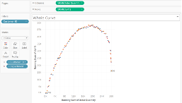

Tableau Training on
Tap Fast Track

Tableau Advanced Analyst

Tableau
Foundation

