Beyond just a technical tutorial, this post by Kevin Flerlage provides insights into best practices for data visualisation that will help you communicate your findings more clearly and persuasively. Kevin’s approach emphasises clarity, usability, and aesthetic appeal, ensuring that your dashboards are not just informative but also engaging and easy to understand. By mastering these skills, you’ll be able to provide more value to your team or clients, making data-driven decisions that can significantly impact your organisation’s strategy and success. Don’t miss out on this opportunity to learn from one of the best in the field!
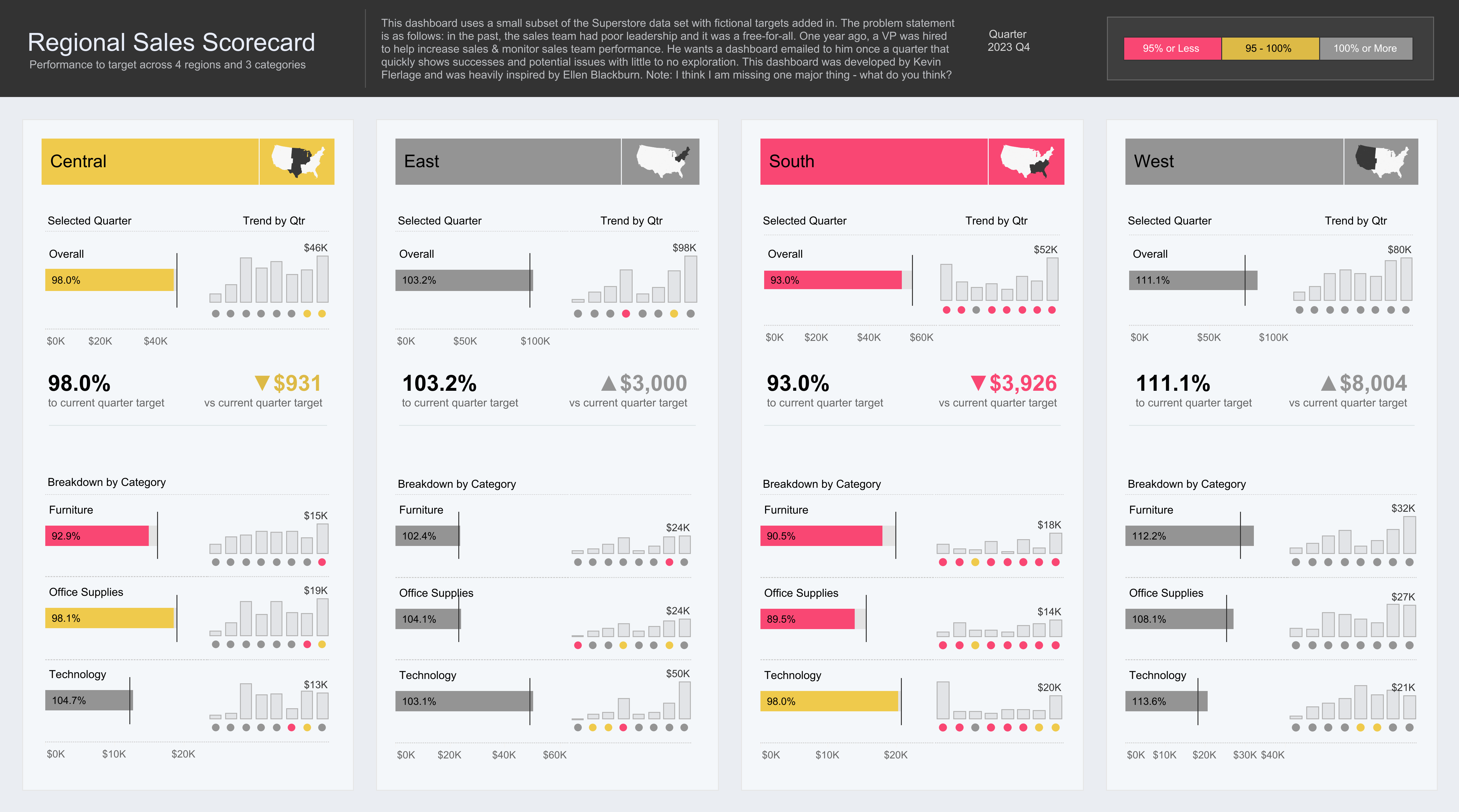

Tableau Training on
Tap Fast Track

Tableau Advanced Analyst

Tableau
Foundation

