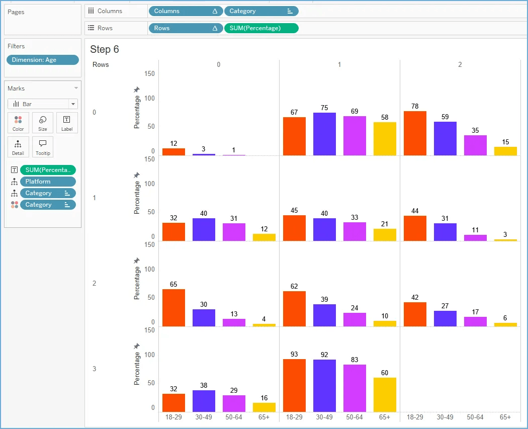
The trellis chart, a highly effective tool for displaying patterns across multiple categories, can seem complex to create. However, Brittany Rosenau breaks down the process into simple, easy-to-follow steps, making it accessible even to those new to Tableau. Her tutorial not only teaches you how to build the chart, but also demonstrates its practical applications in storytelling and data analysis.
The trellis chart’s ability to handle large datasets and reveal hidden trends makes it a powerful addition to any analyst’s toolkit. Reading Brittany’s walkthrough will empower you to create more engaging and informative dashboards – helping you communicate your data more effectively and make stronger business cases with visually-compelling insights.


