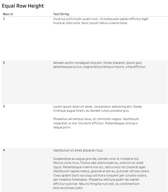
Alexander Mou’s post walks you through techniques to ensure your text adjusts dynamically without disrupting the layout – making your dashboards not only visually appealing but also functional. If you’ve ever faced issues with misaligned text or overflowing containers, this is the guide you need to streamline your designs.
He explores practical solutions like leveraging container settings, using calculated fields for text control, and ensuring your dashboards maintain consistency no matter the data input. Mastering text alignment and adaptability is crucial for an optimised user experience. Dive into this post to equip yourself with tips that will elevate the aesthetics and usability of your Tableau work!


