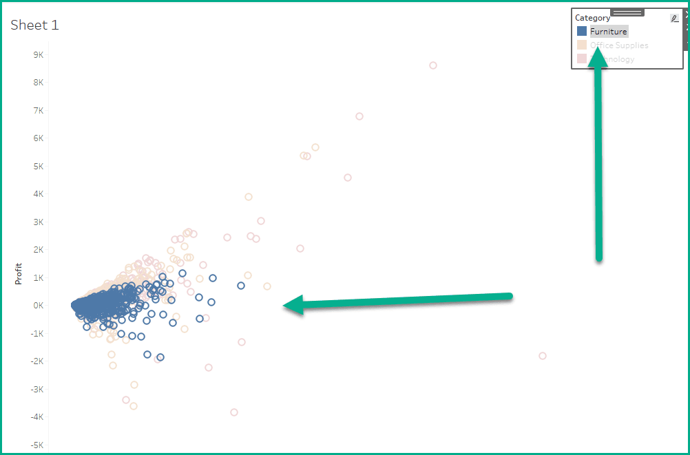
Custom legend buttons not only improve the visual aesthetics of your dashboards, but also introduce interactivity that enhances user experience. Whether you’re wanting to highlight key insights or simplify filtering options, Dawn Harrington’s guide walks you through how to design and implement these features effectively. With clear steps, you’ll be able to create dashboards that look professional and perform seamlessly.
This design feature allows users to explore data dynamically – making it easier to uncover insights and understand the story behind the numbers. Dawn provides tips for integrating these buttons into your dashboards without cluttering your visualisations. This post is the perfect resource to inspire your next project. Don’t miss out on these expert tips!


