EXAMPLE USE CASES OF TABLEAU CALCULATIONS
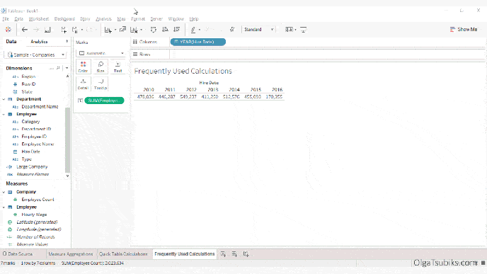
Olga Tsubiks introduces and provides example use cases of 10 frequently used Tableau Calculations. This is part of her guide to help get Tableau Certified and is a great resource.…
Olga Tsubiks introduces and provides example use cases of 10 frequently used Tableau Calculations. This is part of her guide to help get Tableau Certified and is a great resource.…
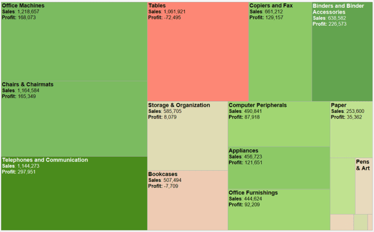
I am a fan of Treemaps, for specific use-cases, but they can be over-used. Elizabeth Ricks illustrates some pros and cons of using Treemaps, plus some possible alternatives. Read Original
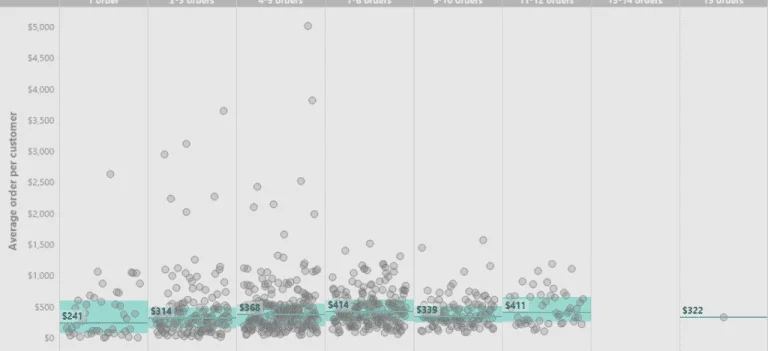
Lilach Manheim walks through an example of the process for analyzing the fitness of averages and provides some ways of not “aggregating away” the insights. Read Original Article…
DATA LITERACY, PART 3: ANALYSING THE FITNESS OF AVERAGES Read More »

Ryan Sleeper uses data from his blog posts to remind us that doing the fundamentals, well, is really what it takes to master Tableau. He then points us to 5
UNDERSTAND AND EXECUTE THE FUNDAMENTALS LIKE A ZEN MASTER Read More »
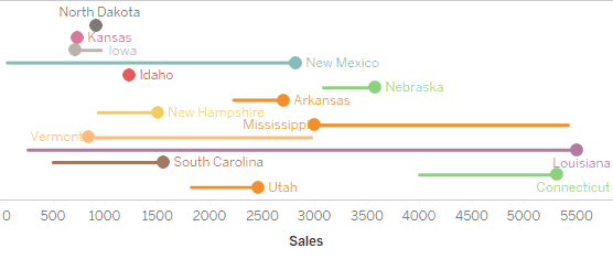
Mark Edwards talks through various incarnations of a design for a tadpole chart. This can be a great way to visualize period-over-period changes for multiple members in a dimension Read
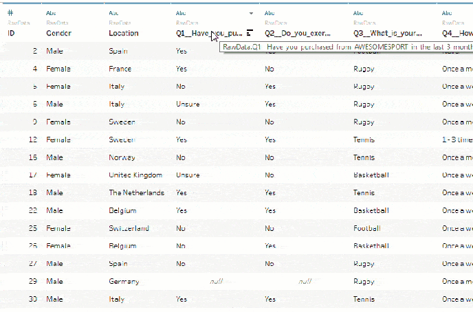
Typically, survey data is formatted so that each row corresponds to an individual respondent and a column for each question. Archana Ganeshalingam, a Product Consultant at Tableau, talks us through
PREPARE SURVEY DATA FOR ANALYSIS WITH THREE EASY STEPS Read More »
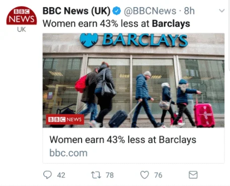
…or, “Breaking News: Senior executives are paid more than junior positions”. Jeffrey Shaffer talks about the dangers of using averages to draw conclusions from the data and gives some great
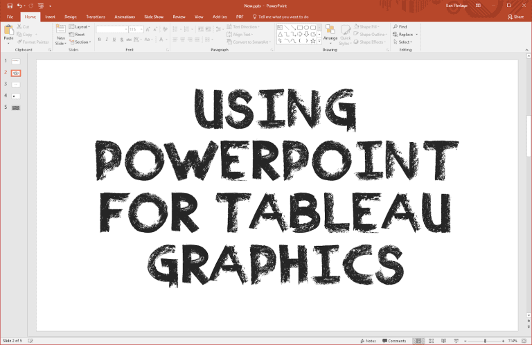
Ken Flerlage points to an older post from Josh Tapley that gave him the inspiration to use Powerpoint as a quick and easy graphics tool for some of his fantastic

Joshua Milligan talks us through a neat workaround to create a cross-database Union – which is currently not supported in Tableau – by using Joins and the MAX function. Even
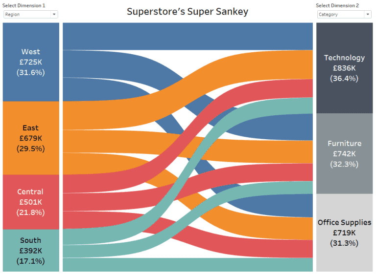
Sankey diagrams show the proportional “flow” (or make up) of one dimension from (or within) another. Ian Baldwin of The Information Lab takes us through his 20-step process to create
HOW TO BUILD A SANKEY DIAGRAM WITHOUT ANY DATA PREP BEFOREHAND Read More »
