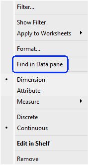
Find in Data Pane
As a consultant, Dan Chissick the relies on rapid, precise access to calculated fields when troubleshooting dashboards with clients – or better yet, avoiding documentation and clicking around aimlessly. This…
As a consultant, Dan Chissick the relies on rapid, precise access to calculated fields when troubleshooting dashboards with clients – or better yet, avoiding documentation and clicking around aimlessly. This…
But it’s not just about the trick – it’s about doing it elegantly. Kim Tricker guides you step by step while avoiding common pitfalls. She even shares handy hacks from
Conditional Formatting for a Single Measure Value in Tableau Read More »

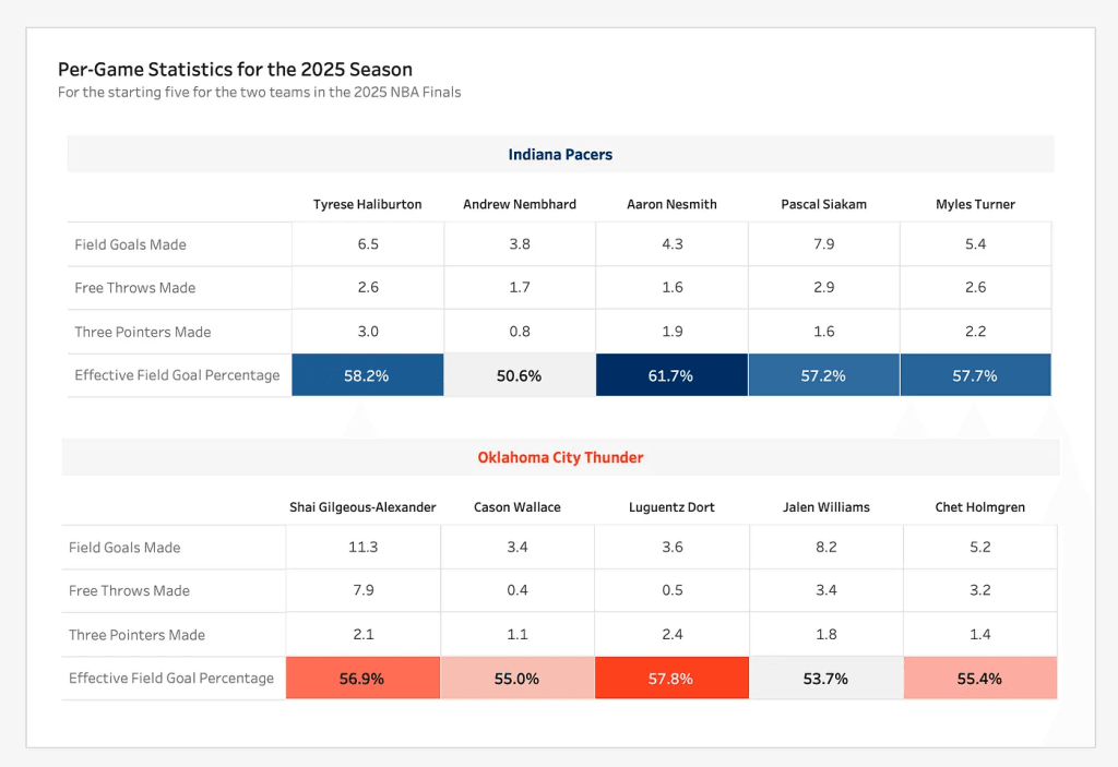
Tharashasank Davurulu’s article isn’t just about style – it’s about strategy. It highlights how well-placed BANs can clarify context, reinforce brand messaging, and elevate user understanding. if you’re looking to
Big-Ass Numbers (BANs): Why They Belong on Every Dashboard Read More »
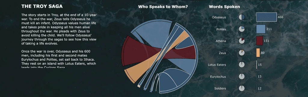
Ever wrestled with a dashboard that needs a dozen-plus colors for different people—and ends up looking like a rainbow gone rogue? Nicole Klassen tackles this chaos by creatively using white
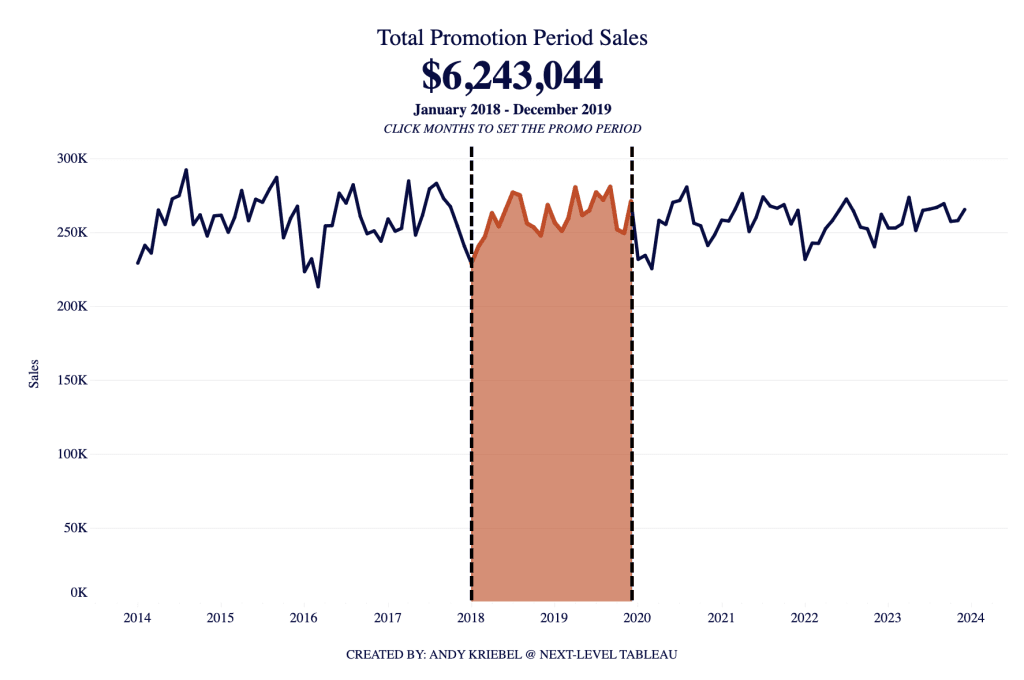
Ever thought parameters in Tableau were single-line thinkers? Andy Kriebel flips that on its head, teaching you how to pack two values into one parameter—perfect for crafting dynamic date ranges
How to Add Two Values to One Parameter in Tableau Read More »
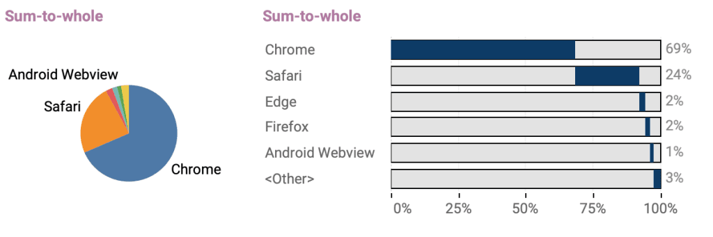
Pie charts might look charming in presentations and reports, but Johan de Groot cheerfully points out that their readability often leaves something to be desired.. Instead, he recommends smart alternatives
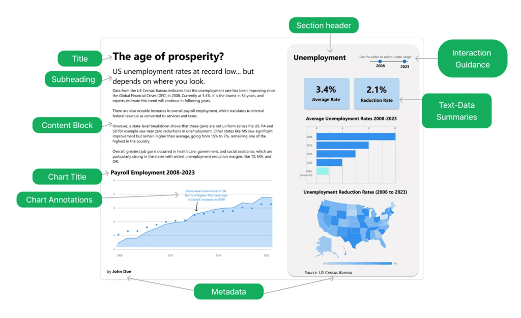
If you’ve ever felt that dashboards talk—but don’t always say much—Anastasiya Kuznetsova unpacks why your writing may matter even more than your visuals. She argues that strong, clear text across
Why Text Skills Matter More Than You Think in BI Read More »

More than theory, Shaun Davis offers a clear framework for evolving into a leader who sets vision, motivates teams empathetically, and navigates corporate dynamics with integrity. He paints a picture
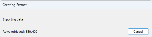
What makes Dan Chissick’s tip especially valuable is how universally relatable it is – many users assume all they can do is wait, but this article offers a practical trick
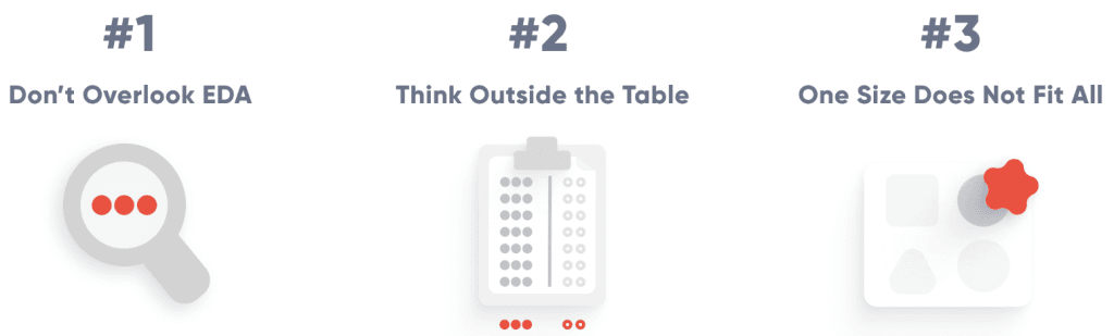
First you start with solid domain knowledge – understanding the business or dataset context helps you design features that reflect real-world signals and improve model interpretability. Second, use feature templates
