Layers in Tableau 2020.4
Tableau’s layering feature introduced in version 2020.4 is a game-changer for creating richer, more dynamic visualisations. Adam McCann walks you through how to stack multiple data elements within a single…
Tableau’s layering feature introduced in version 2020.4 is a game-changer for creating richer, more dynamic visualisations. Adam McCann walks you through how to stack multiple data elements within a single…
Dynamic dashboards are the future of data visualisation and Donna Coles post shares an exciting way to enhance user experience. Instead of using filters just to refine data, she dives

A well-designed dashboard is only as effective as its documentation. Without clear guidance, users may struggle to interpret key metrics, understand filters, or navigate functionalities – reducing the impact of

By incorporating empathy into your approach, you can ensure that your visuals are considerate of different perspectives, experiences, and emotional responses. Here, Jonathan Schwabish and Alice Feng break down strategies
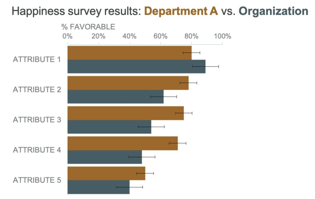
Alex Verez guides us through how error bars can enhance clarity and credibility in your visualisations. Whether you’re working with scientific data, financial metrics, or business analytics, this guide will

A well-designed dashboard isn’t just about making it look good – it’s about making data easy to understand and act upon. Learn how to refine your dashboard layouts, improve clarity,
Seven essential tips for designing better dashboards Read More »

Here is a fascinating exploration of how grey can be effectively used in data visualisations. This article (on Vizku) delves into the concept of using neutral tones to simplify complex
The post with Dawn Harrington introduces a simple yet powerful technique for making your highlight tables more engaging and easier to interpret. By using dynamic colour formatting and calculated fields,

In this insightful article, with Robby White, he walks us through Tableau Viz Extensions are and how they allow you to go beyond standard charts and graphs. With these extensions,
If you’re working with trellis charts in Tableau, you know how powerful they can be for visualising multiple small multiples of data. However, adding clear and dynamic titles to these
