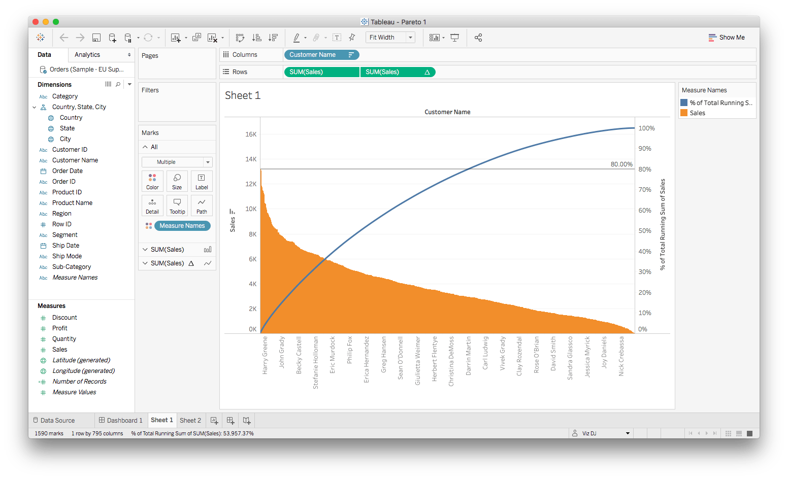
Pareto Chart (the “80/20” viz):
– a type of chart that contains both bars and a line graph, where individual values are represented in descending order by bars, and the cumulative total is represented by the line.
1. Drag Customer Name into Columns.
2. Drag Sales into Rows and ensure the aggregation type is set to SUM.
3. Within that Sales item, click the down arrow and select Edit Table Calculation. Within the new pop-up window, change the Calculation Type to Running Total and Sum.
Ensure Compute Using is set to Table (across) and check-off ‘Add secondary calculation’.
3b. For Secondary Calculation Type, select % of Total. Once this is complete, click the X at the top (it auto saves selections).
Note: There should be a triangle that appears in the Sales item now to indicate a custom calculation has been applied.
4. Within the Marks Area, change the Chart Type to Line.
5. Within the Customer Name item in Columns, click the down arrow and select Sort. Change the Sort Order to Descending and the Sort by to Field = Sales and Aggregation = Sum.
Note: there should be little bar icon in the Customer Name item now.
6. Click the Analytics tab above the Dimensions window. Drag over Constant Line overtop Table and change the value to 0.8
7. Notice the whole view width-wise does not fit in the view. To change this, up top there’s a dropdown that currently reads Standard. Select the dropdown and choose Fit Width. Notice everything come into view.
8. Return to the Data tab above the Dimensions window. Place a new Sales item infront of the existing one in Rows.
9. Under Marks, click on the SUM(Sales) band. Note: it’s important to select the correct one. There is an ‘All’, SUM(Sales) and a SUM(Sales) with a triangle. Choose SUM(Sales).
10. Now, underneath the SUM(Sales), change the Chart Type to Bar. Click the Color Square and change the color to orange (or whatever color you prefer).
11. Up top in the second SUM(Sales) item in Rows (one with the triangle), click the down arrow and select Dual Axis. You’ll notice a percentage axis appear on the right.


