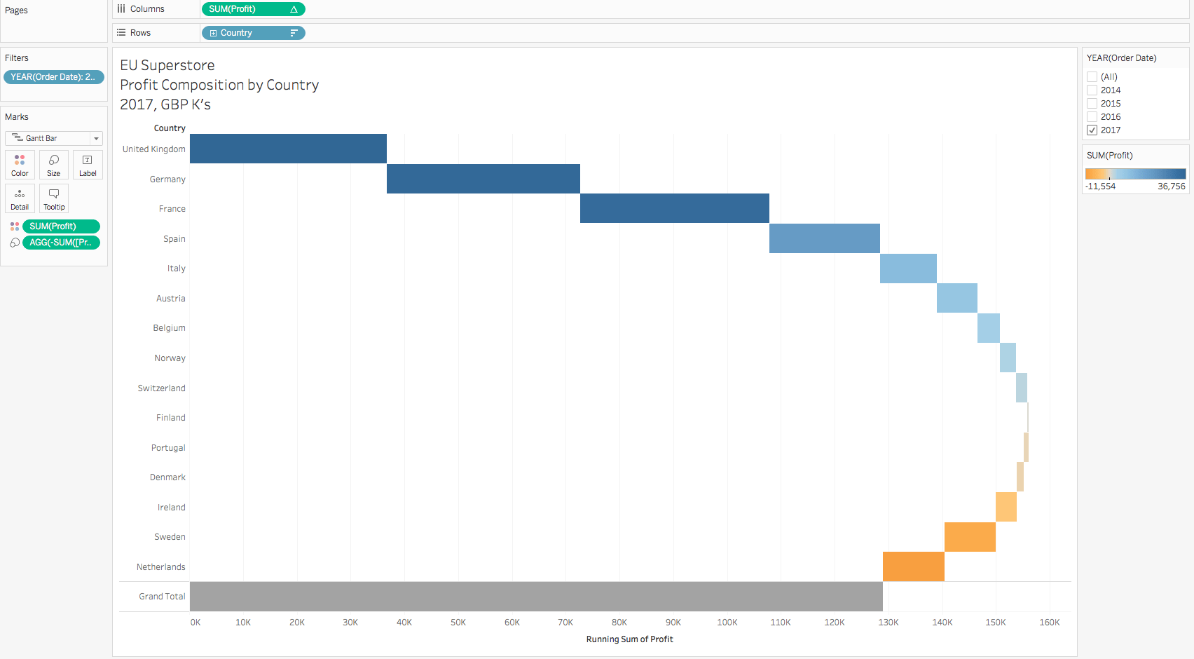
What is a waterfall chart good for?
What is a waterfall chart good at? Discuss composition of negative / positive elements – e.g. profit, variance. Maybe discuss time on x axis, categories on y?
Explain that this is an introduction to building a waterfall in Tableau and the focus is on the basics. Later blogs will look at more complex, real world scenario’s – variances.
Maybe discuss that Tableau isn’t perfect? Post some ideas for voting for improvements?
Methodology
The simple trick to building a waterfall chart in Tableau is to use the Gantt chart type. Typically a Gantt chart is used for mapping time related events, such as projects, but due to the flexibility of how it can be set up in Tableau, it has many other powerful applications (e.g. stock price candlestick chart, highlighting the area between two lines, a tornado (or butterfly?) chart, .
In this first section, we plot our measure against a category dimension and convert the “automatic” mark type to Gantt. This shows as lines, as we have not yet sized the “duration” of the Gantt marks.
Step By Step
- Connect to the EU superstore Excel data source
- Rename Connection to EU Superstore
- [Profit] to columns
- [Countries] to rows
- Right click on the blue [Country] pill in the column shelf, select sort. Choose descending and for “Sort By” select Field. In the dropdown box select Profit and ensure that the aggregation is Sum.
- Change mark type to Gantt Chart

Tableau Waterfall Chart Beginner Part 1
Methodology
As we are using the Tableau Gantt chart type, it is plotting the “start” of the bar and then the “duration” of the event. We have provided the start of the bar as being our profit value and then we are sizing also using the profit value. This would effectively double the profit on each row. In order to overcome this, we want to size by the negative profit, so effectively it “comes back” from the start. Make sense? This logic works for any metric when using a Gantt chart to create a Waterfall chart.
Step By Step
- Size by [Profit]
- Double click size by [Profit] in the marks card and add a “-” at the beginning to change its polarity
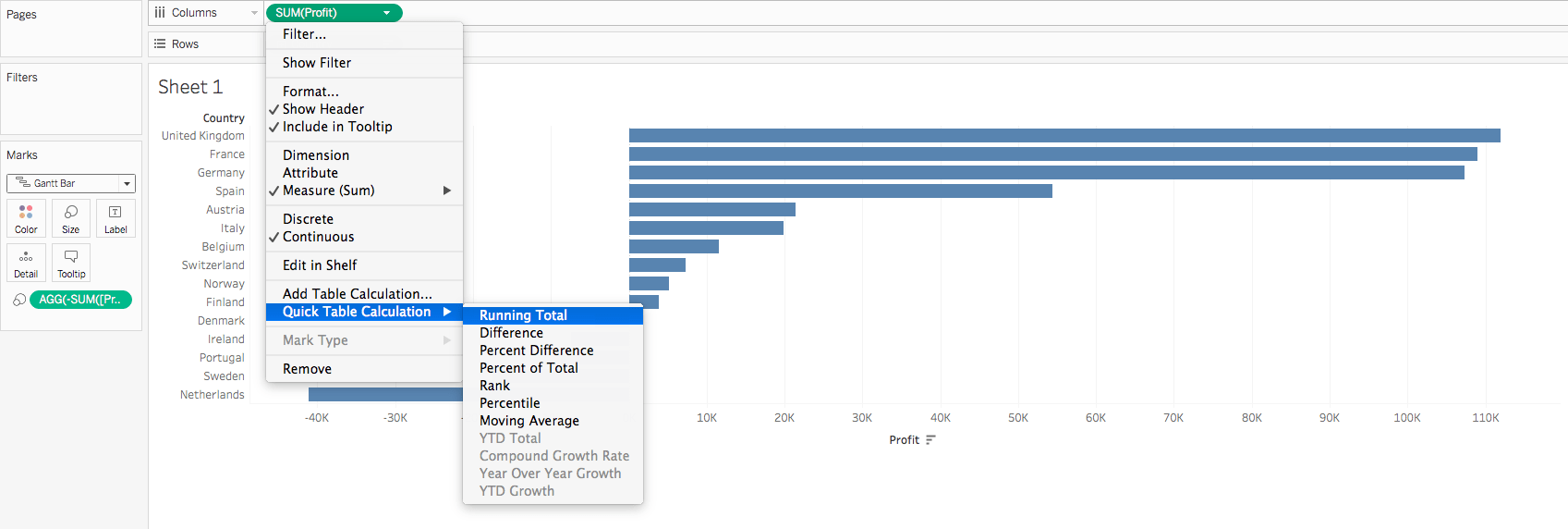
- Add a Running Total Quick Table Calculation to the column shelf [Profit] green pill by right clicking on the pill.

Tableau Waterfall Chart Beginner Part 2
Methodology
Discussion on rationale
Step By Step
- Increase width of bars to max in the marks card
- Analysis/Totals/Show Column Grand Totals
- Drag [Profit] to the colour marks card
- Right click [Order Date], select Show Filters. Deselect all years except for 2017
- Rename sheet to “Profit Composition by Country” and add context to title – Data Source Name

Analysis Options
Discussion on rationale
Step By Step
- In the menu toolbar change from standard view to “Entire View”.
- Add a reference bar to show the maximum profit without losses.
- Drill into year to see the most and least profitable quarters easily by …. Drill back out again by…
- Drag [Order Date] / [Category] / [Segment] or any small element number dimension to the Columns Shelf to see where


