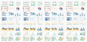
This is part 1 of a 3 part series on going beyond the charts available in the “Show Me” panel in Tableau. In this first post, I’ll dig into my first “aha” moment which
totally changed how I viewed Tableau. In the next, I’ll take these concepts to the next level by introducing some of the math needed to create more advanced custom visuals.If you’re already an advanced Tableau user, then this post is not for you (though I’d love for you to stick around and give it a read). Rather, this first post is for those of you who are where I was this time last year. You’re a Tableau user and know the product fairly well. You may have been using it for just a couple of months or even years. But you tend to only create charts available in the “Show Me” panel. Now don’t get me wrong—there is a reason why Tableau has chosen to include these 24 default chart types.
Beyond “Show Me” Part 1: It’s All About the X & Y By Ken Flerlage
Want to Get Latest Updates and Tips on Tableau Bites Blogs
Sign Up For Newsletter


