VISUALIZING P&L STATEMENTS
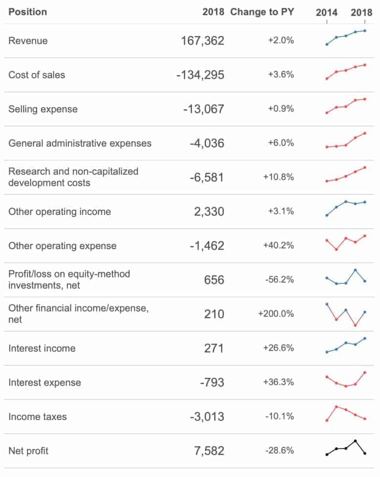
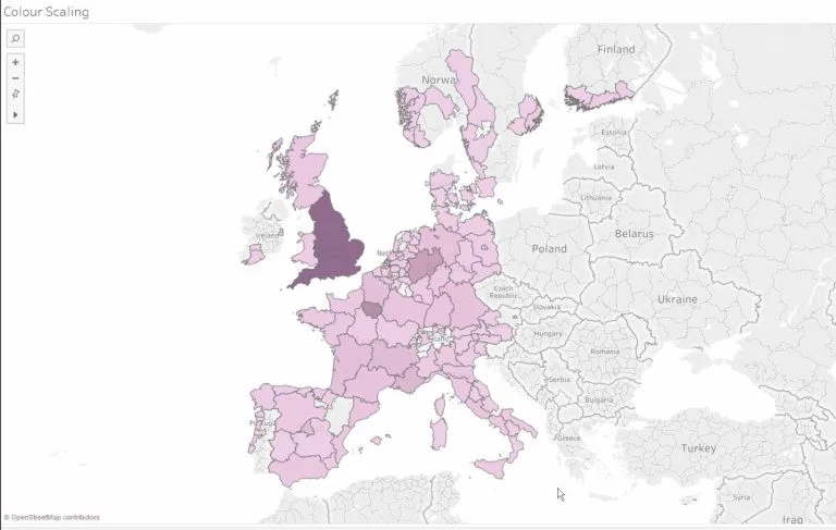
Klaus Schulte explains how you can visualise one of the most important documents for an accountant, a profit and loss statement. The Zen Master mentions using the scorecard approach to…
Klaus Schulte explains how you can visualise one of the most important documents for an accountant, a profit and loss statement. The Zen Master mentions using the scorecard approach to…
Slalom’s Sarah Bartlett shows you how to dynamically colour your tooltip text in Tableau. This is a great way of turning an ordinary-looking tooltip into something that enhances and improves
How to Dynamically Colour Tooltip Text By Sarah Bartlett Read More »
Kevin Flerlage highlights one of the less-promoted features when Tableau 2019.2 was released in May 2019, collapsible containers. Collapsible containers can be utilised in several ways on a dashboard. Whether
Nick Jastrzebski from The Information Lab shows you how to level up your dashboards with an overview of removing values from quick filters by using Tableau’s Order of Operations. There
REMOVING VALUES FROM QUICK FILTERS USING TABLEAU’S ORDER OF OPERATIONS Read More »
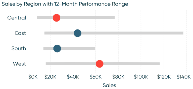
The Principal of Playfair Data is back with another excellent how to article. Ryan Sleeper guides you through how to make ranged dot plots in Tableau. A ranged dot plot
Want to make your KPIs stand out? The Data School’s Joe Stokes demonstrates how to style your KPIs in Tableau to display positive or negative change. This can be incredibly
STYLE YOUR KPIS – DISPLAYING POSITIVE OR NEGATIVE CHANGE Read More »
In this age of digital distraction, designing accessible dashboards in Tableau that does its job for your department manager or business is essential. Bridget Cogley mentions why its important to
DESIGNING TABLEAU DASHBOARDS IN THE AGE OF DIGITAL DISTRACTION Read More »
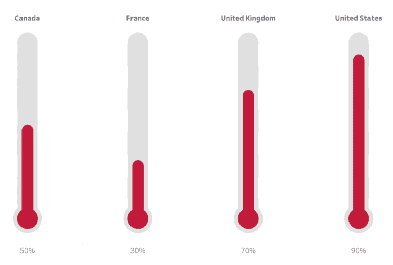
Toan Hoang is back with another of his Tableau Quick Tips as he shows you how to build a thermometer chart in Tableau in five minutes or less. A thermometer
Figuring out where to start with Set Actions in Tableau? Viz Queen Louise Le from The Information Lab has a lovely little tip on changing the selection that impacts the
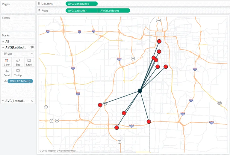
Ryan Sleeper shows you how to make hub and spoke maps in Tableau by using the MakePoint and MakeLine functions to show the location path between Ryan’s 10 favourite barbecue
