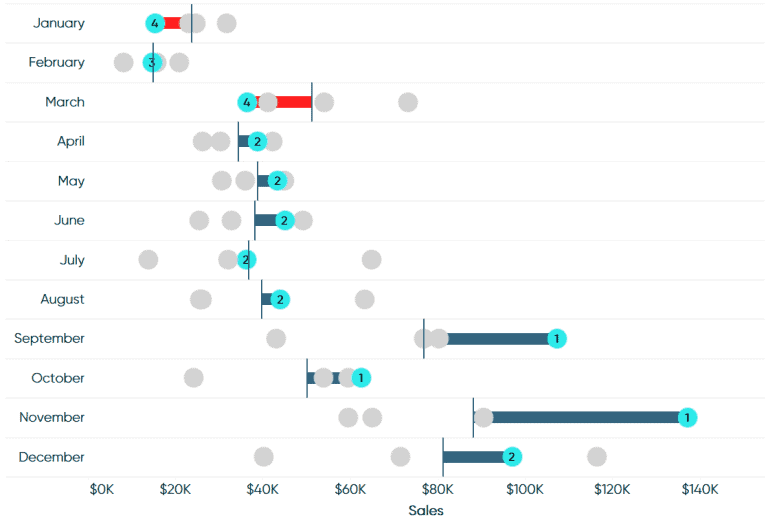
INTRODUCING LEAPFROG CHARTS
Tableau Bites would not be the newsletter it is without having one of Ryan Sleeper’s excellent how-to articles. Ryan introduces a new chart in Tableau, the leapfrog chart, which are…
Tableau Bites would not be the newsletter it is without having one of Ryan Sleeper’s excellent how-to articles. Ryan introduces a new chart in Tableau, the leapfrog chart, which are…
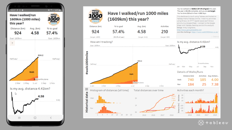
Tableau’s Technical Evangelist Andy Cotgreave highlights the five questions that you should be asking as an analyst when designing a mobile dashboard. Andy explains that you should be building your
5 QUESTIONS TO ASK WHEN DESIGNING A MOBILE DASHBOARD Read More »
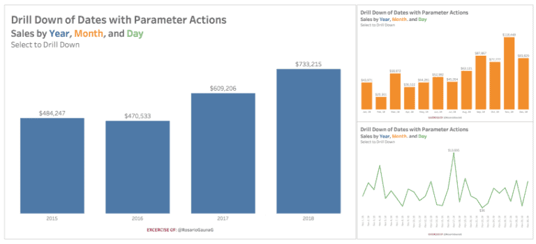
The third and final Zen Master to be included in the 20th edition is Rosario Gauna as she shows you how to drill down of a date while utilising Tableau’s
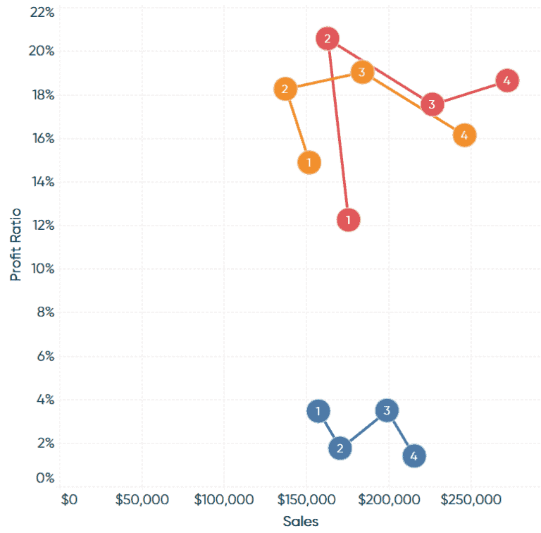
While one article was not enough, we have a second how-to from Playfair Data’s Ryan Sleeper. Ryan shows you how to make the connected scatter plot by connecting the marks
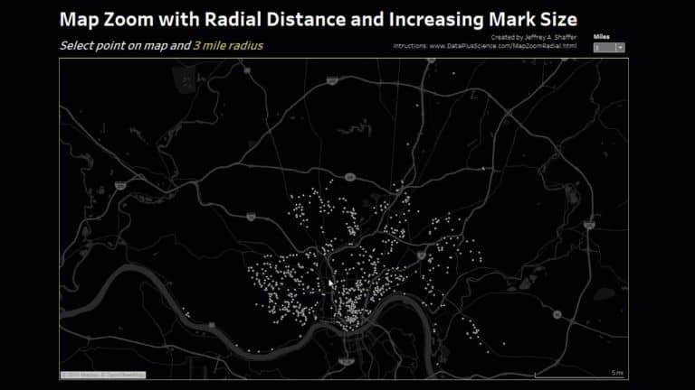
Zen Master Jeffrey Shaffer demonstrates how to create a map that can zoom in, filter, control, show and increase the radial distance, as well as increasing the mark size of
MAP ZOOM WITH RADIAL DISTANCE AND INCREASING MARK SIZE IN TABLEAU Read More »
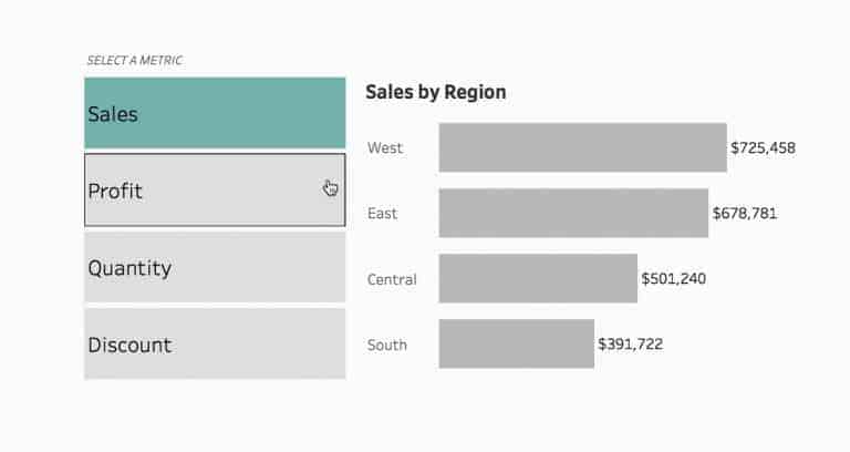
Tableau’s Queen of Set Actions, Lindsey Poulter shows you how to use Set Actions to switch either metrics or dimensions in your dashboard using the tried and trusted Superstore dataset.
HOW TO SWITCH METRICS (OR DIMENSIONS) USING SET ACTIONS Read More »
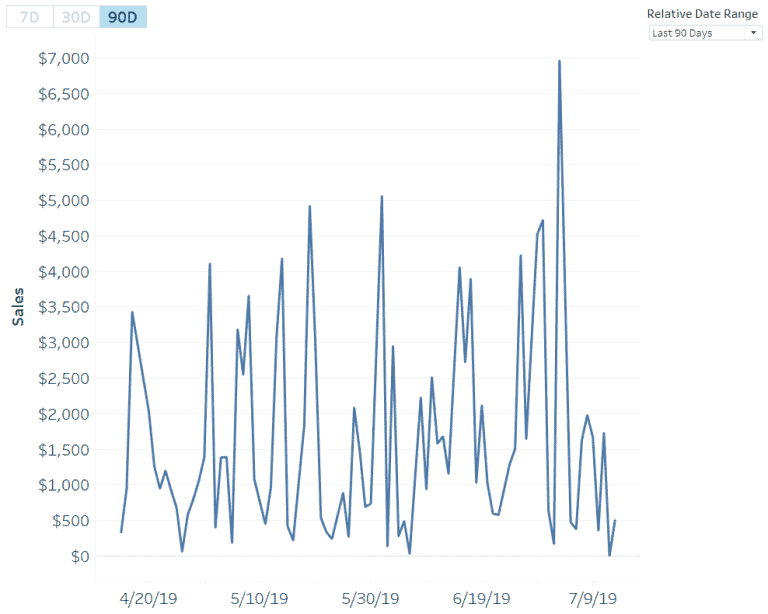
The Zen Masters keep coming as Ryan Sleeper has yet another clever tip up his sleeve towards creating better relative date filters over 7, 30 and 90 days in Tableau.
Points of Viz’ Mark Edwards shows you how to tidy up your Tableau chart labels with secret reference lines. Mark demonstrates how to create space for your labels in your
TIDYING UP TABLEAU CHART LABELS WITH SECRET REFERENCE LINES Read More »
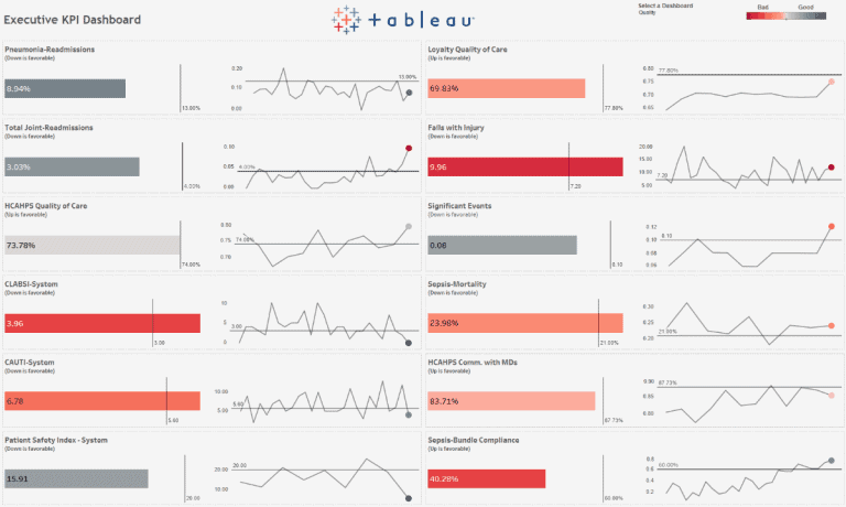
Tableau has released an Executive KPI Dashboard Starter Kit for healthcare professionals. Derek Cyr explains how the starter kit can help hospitals deploy a solution to see and understand the
ACCELERATING UNDERSTANDING WITH THE EXECUTIVE KPI DASHBOARD STARTER KIT Read More »
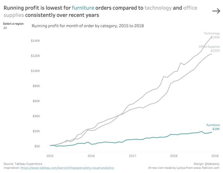
Colin Wojtowycz visually analyses the questions to ‘why’, by using Tableau’s new dedicated dashboard buttons. Colin explains how having different views enables the audience to see different insights from the
