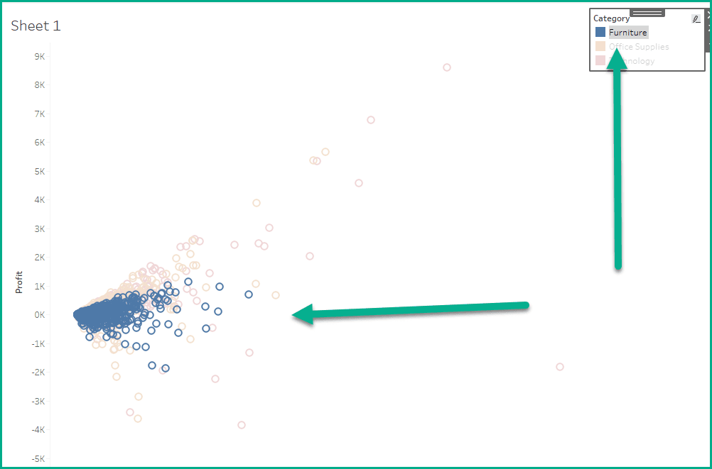
Custom Legend Buttons
Custom legend buttons not only improve the visual aesthetics of your dashboards, but also introduce interactivity that enhances user experience. Whether you’re wanting to highlight key insights or simplify filtering…
Custom legend buttons not only improve the visual aesthetics of your dashboards, but also introduce interactivity that enhances user experience. Whether you’re wanting to highlight key insights or simplify filtering…
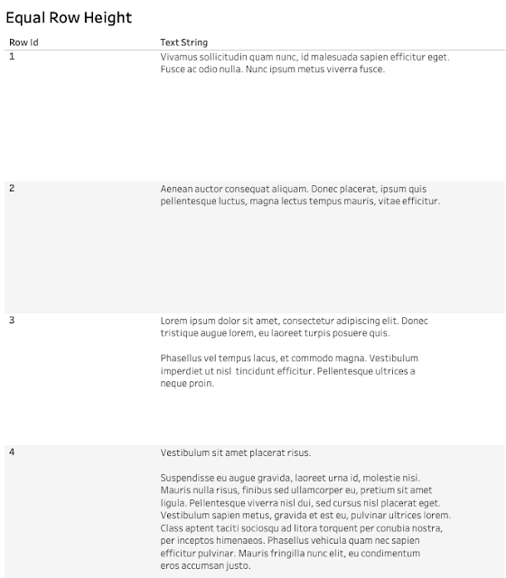
Alexander Mou’s post walks you through techniques to ensure your text adjusts dynamically without disrupting the layout – making your dashboards not only visually appealing but also functional. If you’ve
Accommodating Variable Height in a Text Table in Tableau Read More »
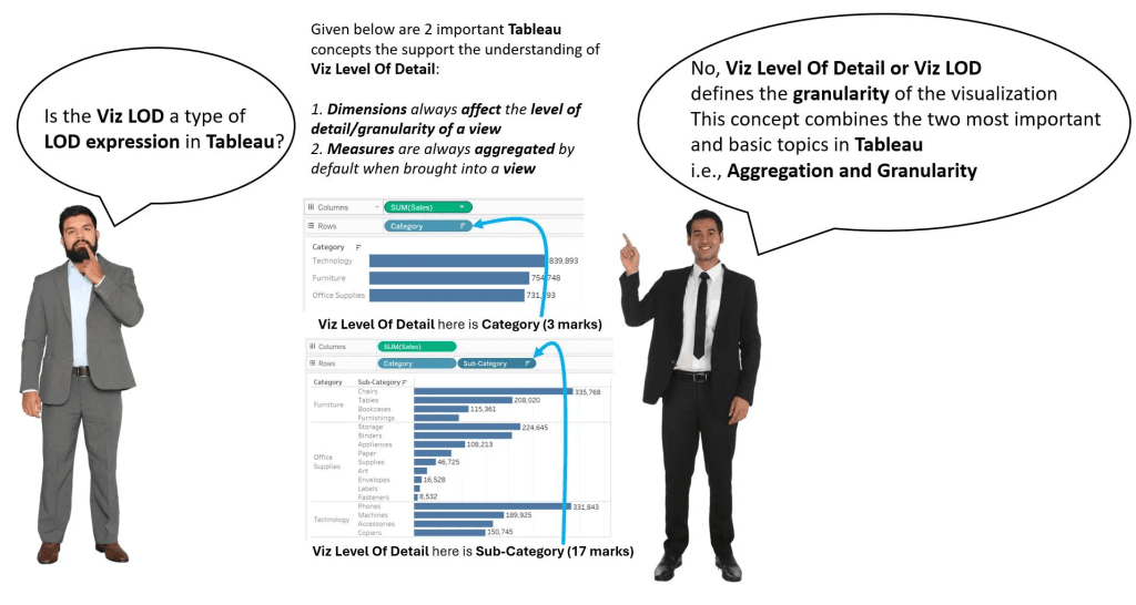
Understanding Tableau’s Viz Level of Detail (Viz LOD) is a game-changer for anyone looking to elevate their data visualisation skills. In his blog post, Deepak Holla dives into this often-misunderstood
Sam Priddy’s post highlights why a properly organised dataset is critical for effective analysis and smooth integration with tools like Tableau. By walking through the principles of creating clean, logical
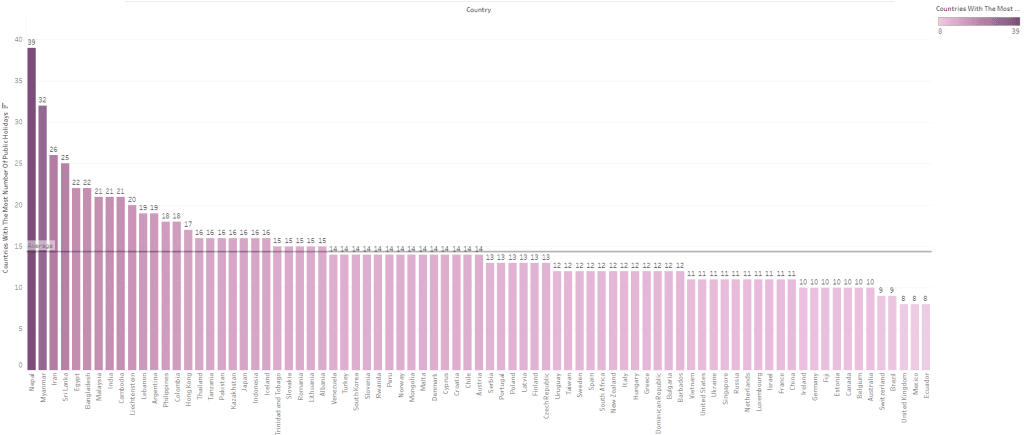
Are you ready to elevate your data visualisation skills and create visuals that captivate and inform? Takhmina Pirmahmadova’s post is a must-read! Her guide explores how to transform a traditional
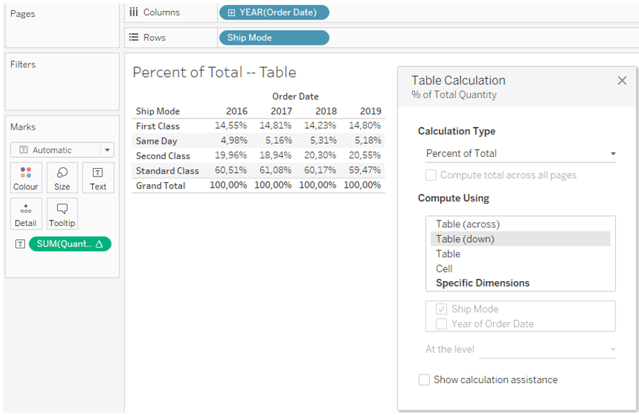
Darinka Markovic provides a comparison of how these two leading tools approach percent-of-total calculations, breaking down the nuances and highlighting key differences. Whether you’re exploring Tableau’s table calculations or Power
Percent of Total — Table Calculations in Tableau vs. Approach in Power BI Read More »
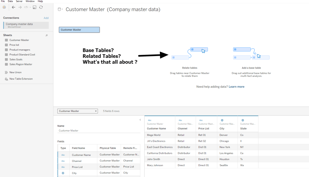
Jim Dehner‘s post on shared dimension inventory analysis is a game-changer for anyone working with complex datasets in Tableau. His guide dives into the nuances of managing inventory data across
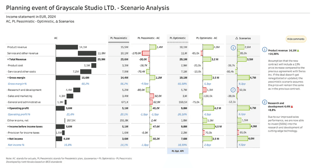
Discover how to build a proactive mindset and implement strategies that help you anticipate and mitigate risks before they escalate. Yvette Kovács‘ guidance is essential reading for entrepreneurs, leaders, and
Kevin Flerlage’s post is brimming with concise, practical insights that can streamline your workflows and enhance the visual appeal of your dashboards. Whether you’re tackling formatting challenges, optimising performance, or
Dawn Harrington (TechTipsGirl) delves into a powerful technique that allows you to dynamically show and hide elements on your dashboard. This ability to reveal or conceal information at the right
