
...Whilst Maximising their Investment and Unlocking The Full Potential of their Data…
Imagine finally being able to increase your team’s efficiency, dramatically reduce overhead costs, and skyrocket the profitability of your organisation..all in under 72 hours!
NOTE: This guide is not for all businesses. It’s specifically for organisations using Tableau, yet feeling frustrated and overwhelmed… and wondering how to get the most out of their investment. Tableau is a powerful tool for data visualisation and analysis – but it’s not without its challenges, which can trip up even the most experienced users.
As with any business insight resource, there can be a multitude of free training tutorials to be found…and Tableau is no exception. The main problem with most of those free trainings is that you end up being force-fed features of Tableau that you simply do not need.
The difference with the Tableau Training On Tap™ program is that we focus on helping you drill down and build dashboards that are based around you, your organisation, and what you actually need…without all the unnecessary fluff.
Having designed this program from the ground up, we thought it would be useful to publish this guide to help leaders identify and overcome the mistakes and frustrations they may encounter when deploying Tableau in their organisation.
In this guide, we’ll go over some of the most common mistakes and frustrations you might have had with Tableau, as well as provide solutions and best practices for avoiding them.
I’ll also share with you my number one resource to get the most out of your data visualisation efforts and avoid falling into the Tableau Trap!
Note: If you want an instant “shortcut” to avoid the most common pitfalls and optimise your use of Tableau…Simply go ahead and CLICK HERE to book a FREE Discovery Call.
“The flexibility, support model, delivery approach were all perfect in ensuring we received a training solution that was spot on for all of our colleagues, regardless of their personal situation, and it did not tie them to a particular classroom window for the most part which was really important”
Michael C, Senior Manager, Lloyds Banking Group
If you’re struggling to effectively create data insights, share simple and easy-to-understand graphs and charts, as well as provide context for that data… this may be the best thing you’ll read all year!
- Manage teams that use analytical reporting software in large Enterprises or Public Sector organisations.
- Are Heads or Directors of Data & Insights teams that rely on software to identify trends and patterns in data that can help drive business strategy and decision-making.
- Are a Project Manager deploying Tableau to manage project scope, cost, and resources.
- Are a CDO who is scaling out strategic data management initiatives that drive efficiency and help identify new business opportunities.
- Are the Team leaders of a group of report writers or analysts who are looking to transition their skills over to Tableau.
If any of these sound familiar to you, then I want to reassure you that you’re on the right page….my team and I are excited you’re here!
In this guide, you will discover how you can create powerful, effective, and
engaging reports that will help your team make sense of your organisation’s complex data.
When you understand how to leverage the power of Tableau dashboards and interactive visualisations…it empowers your team and enables them to drive informed decisions and actions, both repeatedly and quickly.
Table Of Contents
Here’s what I’m going to share with you on this page…
- Meet your Tableau Sherpa. Who the heck is Steve Adams, and why should you listen to him?
- Why businesses are wasting 44% of their workdays trawling through data (and how you can avoid doing the same)
- Your ticket out of Excel Hell (this will revolutionise how you interact with Tableau)
- The Ultimate Juggling Act…Balance these 3 components and take back control of your visual analytics.
- The 3D Method For Mastering Tableau…Introducing the Tableau Training On Tap™ framework
- How to unlock the revenue-generating secrets that are hiding inside your data…right now!
- This ONE super-simple trick will improve your Tableau experience instantly…you’ll be kicking yourself if you didn’t think of it sooner!
Companies and organisations recognise more and more that making data-driven decisions is just good business. Doing so ensures money and resources aren’t wasted in the wrong areas, boosts and streamlines productivity, and overall increases the effectiveness of their products and services.
This increased understanding has resulted in these very same organisations boosting their data-collecting capabilities exponentially – they’re swimming in endless oceans of numbers and statistics on a daily basis.
But this is where companies begin to drown…What is the point of all of this data if you don’t know how to use it?
Peter Sondergaard is the Senior Vice President and Global Head of Research at Gartner, Inc. He sums this up nicely…

Although it’s often claimed that data has become more valuable than oil, we need to remember that, just like oil, data must be extracted and refined in order to be utilised effectively…
Information and analytics are two sides of the same coin. Without both components, it is difficult to gain a clear understanding of data and draw meaningful conclusions from it.
This is where programs like Tableau come in – when used properly, it can take this data, extract and refine it, and turn it into the most valuable resource in the business world.
Take note of the keyword in that sentence: PROPERLY.
If you’re reading this, it’s likely that your organisation is struggling to get the most out of Tableau. You may feel like you’re wasting precious resources on a tool that should be driving business insights and decisions…but you just can’t seem to get it to perform to its full potential.
The good news is, you’re not alone…
I’ve encountered many organisations that find themselves in exactly the same position. Through my expertise and support, I have successfully helped them overcome their challenges and achieve impressive results with this powerful tool. But who am ?
Hi. My Name Is Steve Adams, Founder Of Tableau Training On Tap™…

“Steve is a highly skilled trainer in Software products especially in Tableau. He has in depth knowledge from his time consulting with clients and his deep knowledge of the product. He is able to gauge the experience of the group and react accordingly. Steve should be your #1 choice for independent Tableau training in the UK.”
Daniel R.
Truth be known, many moons ago, I actually started off as an accountant. For obvious reasons, it’s something that I don’t often admit…🫢
Quick side note: If you ever want to clear a room at your next party or avoid getting stuck in a boring conversation at the bar, simply mention that you’re an accountant. It really works a treat.
Alright, now I’ve got that off my chest…
I have over 25 years of experience in turning data into actionable insights. After leaving a very large multinational corporation, I set up as an independent consultant. One of my clients then brought me on board to run their agency, where I would develop business intelligence solutions for their client base and deliver training programs.
Eventually, I discovered Tableau back in 2014, and when I saw it, I realised that although I enjoyed the environment I was in previously,
I was actually living in Excel Hell…
This led me to set up my own Tableau training business in 2017, and I’ve been working on that ever since. My focus is helping new organisations implement Tableau quickly and effectively throughout their whole company…and not just in terms of efficiency but cost effectively as well.
We have trained over 1,000 people in the last 5 years from over 100 companies and public sector bodies…
“I chose Tableau Training on Tap because it looked to cover every element of the data journey; it also allowed this to be part of the job for a good period of time not just a few days out of the ‘office’, and they could bring their own data and own requirements to help work these through. This I felt would help to embed their skills naturally and be supported to do this over a good period of time, to help change a culture challenge that we were faced with”
Ella W, Head of Information, NHS
So let me ask you something…
Have you or your team ever felt frustrated, overwhelmed or stressed with any of the following tasks…
- Visualising and analysing data
- Dashboarding
- Reporting
- Collaboration
Maybe you’re at a crossroads…struggling on ways to turn large amounts of raw data into intuitive and actionable insights, and don’t know where to go, or which step to take next?
Unsurprisingly, countless businesses and organisations are in the same boat – and they’re worse off for it.
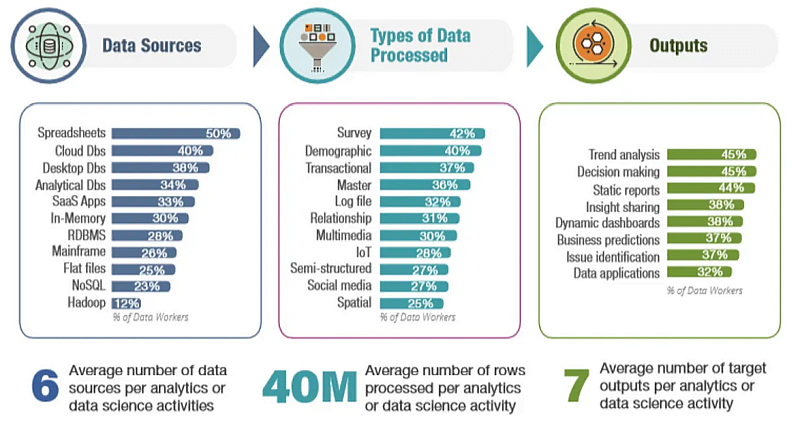
Irvine, CA-based analytics platform Alteryx and IDC recently released a report showing how much time is wasted on data-related activities such as searching, preparation and analytics.
They revealed that on average, data workers leverage more than six data sources, 40 million rows of data and seven different outputs along their analytic journey… Now that’s a heck of a lot of data!
It was also noted that, on average, data workers worldwide are spending a staggering 44% of their workday on unsuccessful data activities.
Why the productivity loss? At the top of the list was juggling multiple technologies.
Additionally, the report also found that teams lack the necessary skills and knowledge to effectively use their chosen analysis software and extract valuable insights from the data.
Sounds familiar, doesn’t it?
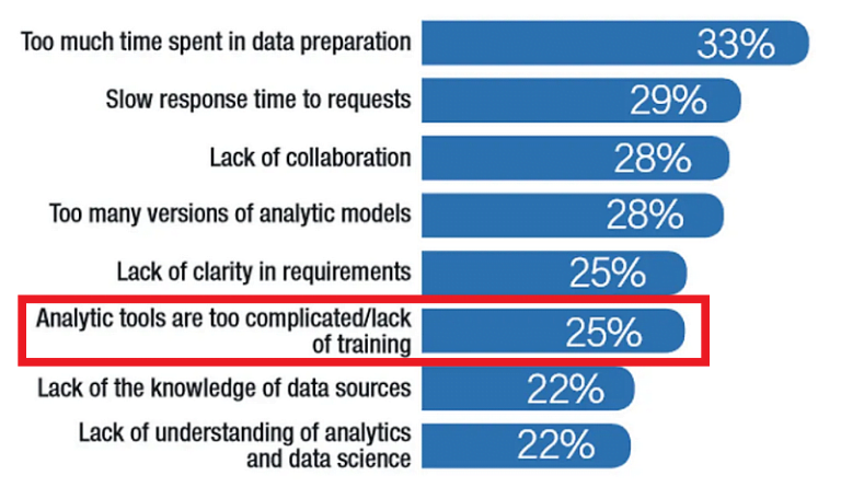
A quarter (25%) of workers reckon that their analytics tools are too complicated and cite a lack of training.
Without proper coaching, analytics teams are not able to fully utilise the capabilities of data software, leading to suboptimal results and potentially flawed or misleading insights.
Over the past 25 years, I’ve seen this same story play out time and time again.
But I’ve also seen the significant improvements companies can make when they are able to fully leverage their data…
And that’s why I created Tableau Training On TapTM – I wanted to see organisations get more out of their data while wasting less time and money.
If that’s all you need to hear, and want our help…Awesome!
We’re excited to show you the most common pitfalls to avoid, and provide expert coaching on how to optimise your use of Tableau…
Simply go ahead and CLICK HERE to book in your
FREE Discovery Call
So…at this point, you might be asking,
“What is Tableau Training On Tap™?”
Well, I’m So Glad You Asked…
Tableau Training On Tap™ is a step-by-step framework that transitions “reporting squirrels” into becoming “agile analysts”.
This is a 3-day intensive Tableau training program, with 6 weeks of ongoing support to help you put the theory into practice. This includes online learning combined with regular live coaching calls.
Unlike traditional training, we will not only cover the how to use Tableau, but also the what and the why.
Our coaching program has been designed to give you the ability, confidence and speed to combine multiple data sources and views into a single, cohesive, user-friendly dashboard.
The key to achieving this is to get yourself smack-bang in the centre of the Three Pillars of Visual Analytics.
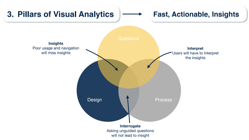
Boiled down to its simplest form, mastering the art of visual analytics is about learning to correctly utilise all of these three pillars at once. The most common issues companies face with data analysis is typically due to them lacking in one or more of these areas.
Let’s take a quick look at each of the pillars and why they are so instrumental to data communication.
- QUESTIONS
First and foremost, you need to define what questions you want a dashboard to answer. You need to gain a deep understanding of exactly what issues stakeholders are looking to address.
This goes further than just asking one question; you need to ask enough to get you down to the root of what’s actually causing the outcome that’s being questioned.
Asking the right questions lets you know what data you need to collect, and which path you will go down with your Tableau dashboard.
- DESIGN
Design plays a critical role in how your users will understand the information you’re trying to put across to them, in terms of both accessibility and understanding.
The dashboard you design needs to be user-friendly; the goal should be to ensure your users can easily navigate your dashboard without needing to be trained in Tableau themselves.
Much thought also needs to be put into the design of your data visuals – you need to make it easy to understand exactly what information you are highlighting, and what the key takeaways are.
On top of this, I strongly recommend you keep in mind how easy it is to unintentionally present your data in a misleading way – it’s unfortunate, but it happens.
Spoiler alert: In Tableau Training on TapTM, we do this by using the 5 Whys – you’ll learn about this in Module 3.
Join Us HERE today and start drilling down to get solutions!
- PROCESS
Your dashboard-building process needs to run smoothly and efficiently. The major factors in ensuring this happens are collaboration and iteration – essentially, communication.
Consistent communication with stakeholders throughout your entire process gives you the opportunity to check-in and make sure you’re on the right track. This will ensure you’re building a product that they need and can actually utilise.
When you combine the Three Pillars correctly, you create fast, actionable insights that will solve problems and boost performance.
But what happens when you combine them incorrectly? I’ll give you some equations…
QUESTIONS + DESIGN = users will not understand dashboards and will not be able to navigate through, therefore missing key insights.
QUESTIONS + PROCESS = users will be left to interpret insights on their own. They will take longer to understand insights, and will feel demotivated because they have to work overtime just to get answers.
PROCESS + DESIGN = users will ask tons of unguided questions. They won’t be able to get to the solutions they actually need.
The Tableau Training On Tap™ program is designed to not only get you in that sweet spot between the three pillars, but to teach you how to stay there.
But how do we actually do this?
Here’s a quick overview of the
Tableau Training On Tap™coaching program…
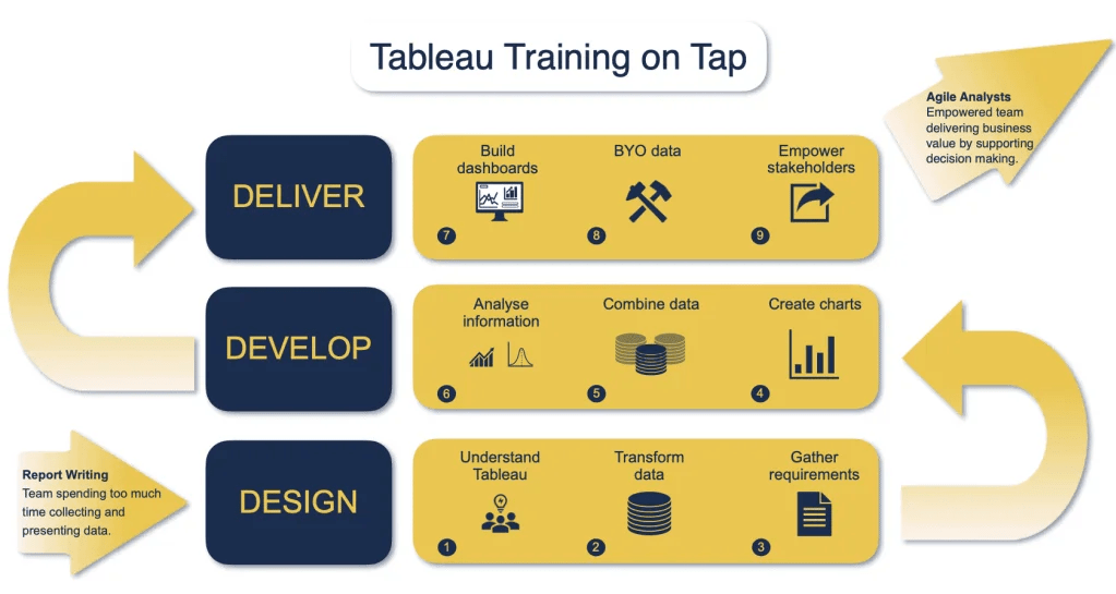
Inside Tableau Training On Tap™, we apply a unique teaching system that we like to call The 3D Method. This proven method consists of 3 phases – Design, Develop, and Deliver – which are then further broken down into 3 modules each.
Let’s take a quick dive into what these phases consist of and how they’ll transform those reporting squirrels before your very eyes!
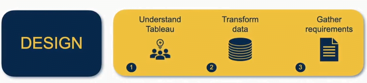
MODULE 1: Understand Tableau
This introductory module brings your team onto a common understanding of what Tableau is, as well as giving insight into the art of the possible. We cover the basics of how the program works, how to navigate it, and what can happen for your organisation when Tableau is used to its full potential.
MODULE 2: Transform Data
Once we’ve established what questions our organisations need us to answer and we understand how things come together in Tableau, we can connect to and transform data. Module 2 is where you will learn to input data into the program efficiently and effectively. We’ll be using calculated fields so that we can add in metrics that may be missing in our data or add certain slants on those metrics which can be useful for our analytical purposes.
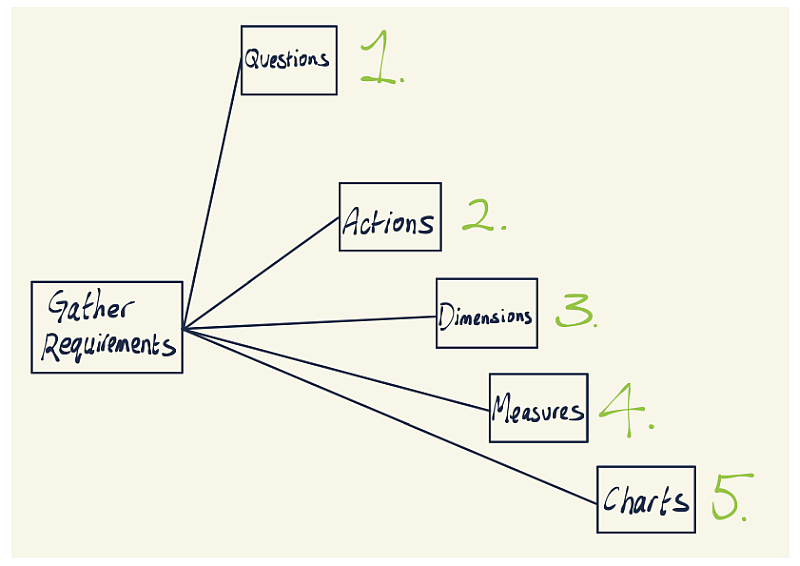
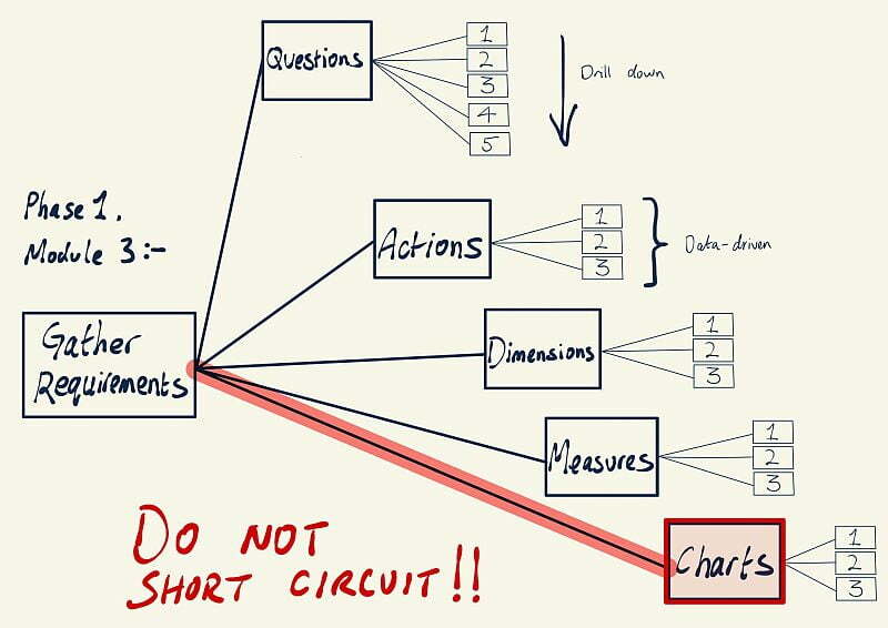
MODULE 3: Gather Requirements
The third module addresses the task of gathering the requirements of your stakeholders and determining exactly what data you need to convey to them.
- What questions do they need us to answer?
- How would they walk through those questions once they get the answer?
You see, it’s all very well knowing the first level of questions they have, but we need to understand their drill-through path. Doing so will make sure that we’re getting the right data into our dashboards…allowing us the best opportunity to replicate the line of questioning of our stakeholders, and give them answers they can actually use.
But at Tableau Training On Tap™, we can do better than that…a lot better.
You see, before we start designing and analysing, we need a deeper understanding of what questions we need to answer. So, in order to get past the initial stakeholder questions, it’s imperative that we drill down.
By taking the “5 Whys” approach, we can understand what actions we want to drive, and ultimately, we discover the root cause of outcomes that we are investigating.
*Full Disclosure: While I didn’t invent the 5 Whys technique, I can certainly see the immense “thought processing power” it provokes. It’s a simple tool that can be used quickly and effectively. As a technique, it is typically applied when problems involve human factors or interactions. (Otherwise known as “dashboard users”  )
)
In using the 5 Whys, we discover what data we need to gather in order to meet our real objective and what dimensions and measures we will need to analyse.
And then, we can start our multiple drill-down paths and cross-questioning (dashboard actions, tooltips, hierarchy drill-downs, etc.) and eventually understand what data-driven highlighting and formatting make sense.
When you incorporate the “5 Whys” approach into gathering your data, It helps identify the root cause of problems, as well as determine the relationship between them.
It’s a simple tool that can be used quickly and effectively…as Ella Worsdale quickly discovered…
Before her team came onto our coaching program, Tableau Training on Tap™, Ella said:
“The dashboard was seen as the end goal, rather than why it was asked for in the first place. The fact that it was there to solve a business problem.”
When I asked Ella why they chose Tableau Training on Tap™, she followed up with:
“What we realised we wanted, was analysts that understand the business challenges, the requirements, how they have to get the most appropriate way [to present the information] considering the user experience and making sure it’s actually solving the problem that we were asked for in the first place.”
As a Tableau Ambassador and co-leader of a Tableau User Group, Ella definitely understands a thing or two and knows what she’s doing…
TLDR: When rolling out Tableau…don’t just focus on the “how-to.” Enlighten on the “what” and the “why.” Don’t short-circuit straight through to building charts and putting them on a dashboard.
Rounding out this module, we will also go over some common, sometimes hidden, pitfalls you absolutely need to avoid.
PHASE 2: DEVELOP
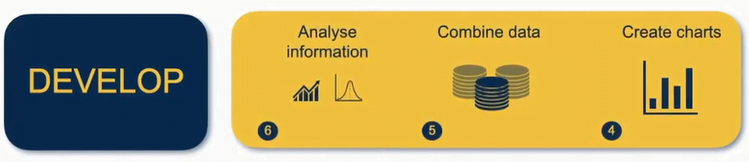
MODULE 4: Create Charts
Now we start getting into the fun stuff. In Module 4, you will learn how to take data and turn it into exciting visuals. Not only will you start creating a wide range of charts and graphs, you’ll also learn how to accurately interpret them.
MODULE 5: Combine Data
It’s very rare to have one single neat and tidy source of data to work with. Trying to combine multiple streams of information is the cause of many headaches for both data newbies and old hands alike.
But it doesn’t have to be this way!
In this module, we will uncover the secrets of using multiple data sources to provide you and your organisation with deeper insights.
If you are working in an organisation where somebody else is providing the data to you, and you’re connecting to that through Tableau, then this Module is going to be a real eye-opener. Your mind will be blown when I help you to understand all the different ways that we can combine data.
Doing so ensures that you can have an articulate conversation with people who are providing that data to you so that you can make sure that you’re getting the most out of Tableau together.
MODULE 6: Analyse Information
In Module 6, you will learn how to analyse data effectively. You’ll be taken through how to identify points of interest on your graphs and charts, allowing you direct people’s attention to noteworthy information.
We’ll begin to dive into Tableau’s analytical tools and frameworks, as well as looking at case studies so you can start flexing your newfound analyst muscles.
PHASE 3: DELIVER
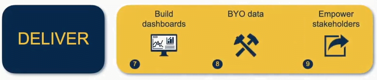
MODULE 7: Build Dashboards
As we move into the Deliver phase, Module 7 will lay the foundations of communicating your data and analysis to the people who need it. You will learn to combine your analysis and charts, build dashboards, and tell data-driven stories.
MODULE 8: Bring Your Own Data
In this module, you will bring your own data to create Tableau templates specific to your company’s needs. Making full use of templates will streamline the way your team uses Tableau.
When it comes to communicating data, one of the biggest time-wasting activities is attempting to create bespoke solutions every single time.
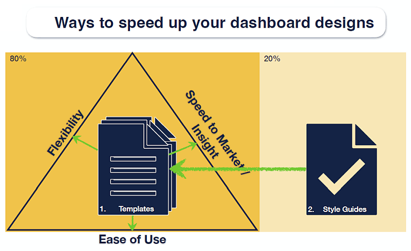
Learning how to create templates and style guides (custom to your organisation) will allow you and your team to:
- DECREASE design time
- INCREASE the speed at which you gain insights
- INCREASE ease of use
All of which are vital for saving time and money.
During this module, we look back to the information you gathered in Module 3 and use that as a reference point for creating templates for you to use over and over again.
MODULE 9: Empower Stakeholders
In our final module, you will empower stakeholders in your organisation by providing them with your new analytical products. You will learn how to navigate Tableau servers, publish your creations, and allow others to access them.
This is quite exciting because when you place those insights in front of your colleagues, it allows them to drill down through those dashboards and answer those questions that they need to.
Don’t forget that the Tableau Training On Tap™ program has LIVE coaching sessions throughout the 6 weeks of ongoing support.
You can bring along your challenges to the Q&A sessions and discuss them with us.
If this excites you…and it should…CLICK HERE to book your
FREE Discovery Call now!
At the end of this transformative program, you will be able to confidently deliver visually appealing, streamlined Tableau dashboards which are designed to meet, and in many cases exceed, the needs of stakeholders in your organisation.
This is priceless, as they will have the ability to quickly and easily explore, analyse and unlock the value of the data to make more informed data-driven decisions.
You will also find that exploring and analysing this data will be quicker than you ever thought possible, helping you side-step the need to hire additional data analysts or purchase expensive data analysis software.
Once you learn how to deploy Tableau effectively, your organisation can improve communication and decision-making, enhance customer service, and increase productivity…resulting in improved performance and higher profits.
“I would recommend this course to anybody interested starting out in, or seeking to move into a role, developing dashboards in Tableau.
The programme builds from the basics, up to intermediate level, with well structured coaching and materials, supported by professional coaches who understand the subject matter to an advanced level and are able to bring the subject matter and the materials to life, sharing their knowledge and setting aside regular time to support students.”
Craig L
Senior Manager
Reporting and Performance Management
So Now You Have A Choice…I Will Leave You With Three Options
Option 1: You go it alone…
This is what I would call the Do It Yourself option. And honestly, if that’s the way you want to go, that’s a-okay. After all, that’s how I gained my knowledge over the past 7 years on Tableau.
You could build up the style guides yourself, build up the templates yourself, build up the capabilities within your own team…then scale and roll them out to your organisation. Heading down this route can be a HUGE risk in time and quality, not to mention the financial cost.
If you think you’re traveling well on your own path, all power to you!
Option 2: Get someone to build Tableau out for you…
This is what I would call the Done For You option. Basically, you go out and pay a consultancy to help skill up your team and your organisation and build the assets.
So that could mean engaging them to build out the dashboards or the templates and scale those out to your organisation.
While this is likely to get the job done (if sourced well), this is an ongoing process that won’t help you do it again in the future, any cheaper or better.
Option 3: Work with an organisation that will do it with you…
This is what I would call the Done With You option. Great choice!
The goal of my organisation typically is to help you confidently transition over to a Do It Yourself capability as quickly and cost-effectively as possible.
And that’s exactly what we do as we take you through our Tableau Training On Tap™ Program.
Our coaching program motivates and instills confidence in you. Best of all, together, we’ll work with your own data to build dashboards that will enable you to make decisions that improve performance in your organisation.
NOTE: At Visual DJ, we don’t just work with anyone and everyone.
While we are passionate about helping teams deliver Tableau dashboards that drive decisions and actions, both repeatedly and quickly…
There are certain criteria for that call to not only make sense for you but as well as making sense for us.
So please do not book a call if…
- You haven’t yet decided that Tableau is going to be your weapon of choice.
- If you want your team to produce labor-intensive tailor-made, bespoke solutions each and every time…then we’re probably not the right organisation for you.
- You’re happy with your current process and progress on your roadmap…I don’t think you need to talk to us right now.
- Your team is not able to do the work.
People who should book a call are the ones that…
- Want their team to use Tableau as their analytical weapon of choice.
- Don’t want their team to stay as reporting squirrels.
- Want their team to transition over to being a motivated group of agile analysts.
- Want to produce more insights with the same level of resources.
- Have team members who are willing and able to do the work
If you have said yes to any of the above, then we’re excited to discuss how we can help your team on their journey to becoming agile analysts with Tableau.
To start that process, go ahead and click here to book in your
Spaces are limited, and there’s only so many people we can talk to on any given day, so go ahead and book your call now!
When you go to that link, you’re going to see a YELLOW “Book A Discovery Call” button, where you can schedule a time.
You will then be asked to provide a little information on where you are on your Tableau journey (which will only take a few minutes).
Then, go ahead and watch our short video to help us make the most of the time on your Discovery Call.
On your call, we’ll discuss…
- Where you and your team are right now.
- Where do you want you and your team to be in the next 3 to 6 months.
- And whether our coaching program, Tableau Training on Tap™, might be able to assist you in getting there faster and more cost-effectively.
And if for any reason, either of us decides that we are not the right organisation for you to work with, then I will be more than happy to point you in the direction of some other resources that may benefit you on the next steps of your journey.
And look, I know that if you have read this far down the page, then we can both agree that something in your data analytics and reporting could be better…right?
- Maybe you don’t have enough time or skills to teach your team to use Tableau effectively.
- Maybe your team is too slow to build dashboards.
- Maybe the dashboards that your teams are producing are not effective or well-received by their stakeholders (we see that A LOT).
- Maybe your team believes that Tableau will not do what they need it to.
Whatever Tableau challenge you’re running into, I promise you we’ve seen it, we’ve coached on it, we’ve trained on it, and we know how to fix it. Let us help you…
Together we will figure out exactly what we need to fix and exactly what we need to change. You can then go forward with confidence and a crystal-clear game plan for how your organisation can get from where it is today to where you want to be.
One last thing…
Our training will help your organisation to use its data more effectively, which can lead to improved performance and increased revenue…And we’re equally as excited to help you streamline processes and improve the overall efficiency of your team, which leads to cost savings over time.
In other words, I HIGHLY encourage you to book a call with me…
However, even if you don’t decide to join Tableau Training On Tap™, there is one important thing I really want you to take away from this, especially if you have invested in Tableau and become increasingly frustrated with your experience.
And that is to Keep It Simple…and upgrade your dashboard by decluttering.
We’ve all been there. You’re trying to make sense of a dashboard…but the charts are confusing, the navigation is unclear, and it just looks like a total mess.
But where do you start? The key is in the design. And the number one best practice for designing dashboards is:
Keep it simple. Yep, as the old saying goes, “less is more.”
That might sound like common sense, but you would be surprised how many people try to cram far too much information into their dashboards. A dashboard should be easy to understand at a glance and should only contain the most important information.
Starting any dashboard design process on your own can feel overwhelming, and keeping things simple also makes it easier for you to get started with the building.
Keeping it simple also ensures that your dashboard is easy to use and interpret, which can ultimately lead to better decision-making across your organisation. So next time you start designing a new dashboard, remember the golden rule:
Less is more!
I hope you enjoyed reading this guide. It was fun to put together, and I’m confident that there are many Tableau takeaways that you can go away and implement right now!
To learn more about how we can help your organisation deploy Tableau in a more streamlined and effective way… I strongly encourage you to CLICK HERE and see what we have to offer.

Steve Adams
Tableau Training On Tap™.


