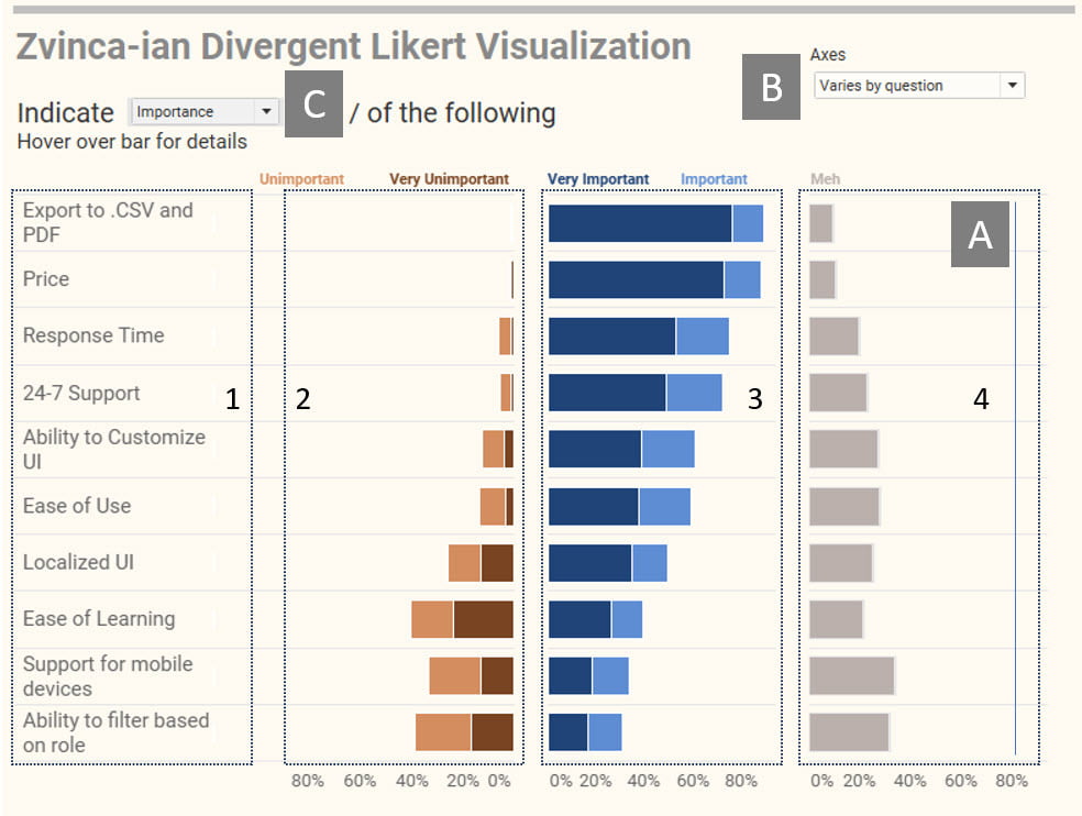
The blog post by Steve Wexler discusses a novel approach to visualising Likert scale survey data. The Zvinca plot, named after its creator, Cristian Zvinca, is an alternative to the usual bar or stacked bar charts used to represent such data. It combines the best elements of both to offer a more comprehensive, intuitive view of the data – particularly useful for comparing two groups’ responses across multiple questions, as they clearly illustrate the percentage difference between the groups.
Starting with a basic bar chart and gradually adding modifications to transform it into a Zvinca plot. The final result is a dual-axis chart, which enables quick and easy comparisons.


