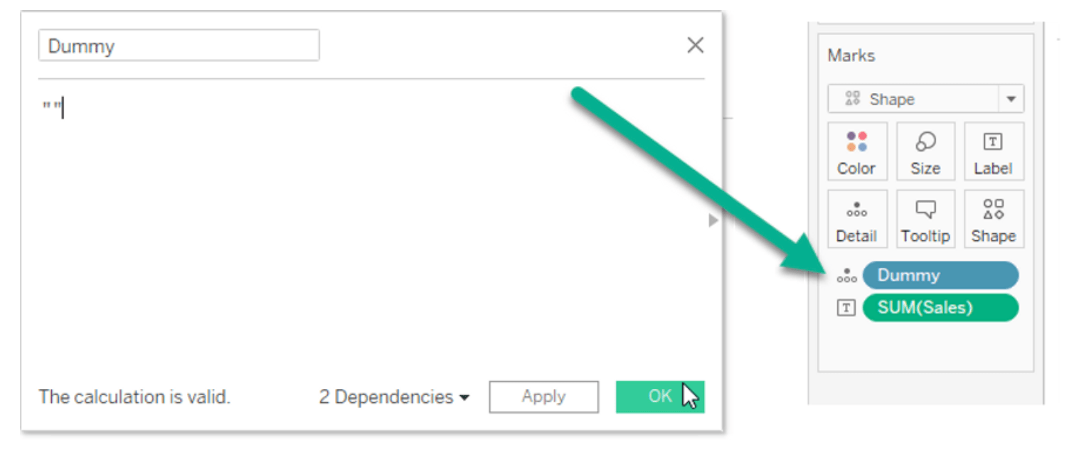
Unlock the secrets to polished dashboard design with Dawn Harrington‘s post on removing the blue highlight. In the realm of data visualisation, every detail matters, and the blue highlight can sometimes detract from the overall aesthetics and user experience. However, here, Dawn offers a straightforward solution that empowers readers to elevate their dashboards to the next level of sophistication and professionalism.
Whether you’re designing for business presentations, academic reports, or personal projects, the techniques shared in this post will undoubtedly set you on the path to dashboard mastery.


