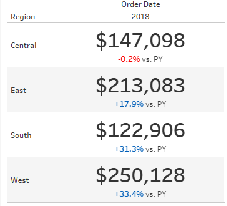
Using colour is one of the most powerful ways to bring attention to key details within a visualization. Using big numbers is a favourite within the business world and
adding a colour to denote positive or negative change is a quick and easy way to quickly communicate the important information.I’ll show you a really quick and easy way to show two different colours depending on whether the change compared to a previous year (or whatever metric) is a positive or negative number.
Style your KPIs – Displaying positive or negative change By Joe Stokes
Want to Get Latest Updates and Tips on Tableau Bites Blogs
Sign Up For Newsletter