This tutorial, by Ryan sleeper, will show you how to make a traditional Pareto chart in Tableau and three ways to make them even more impactful. He’ll cover how to: (1) visualize the 80/20 rule by converting axes into percent of total calculations, (2) isolate the best-performing segment for further analysis, and (3) export the best-performing segment for use in real-world applications…
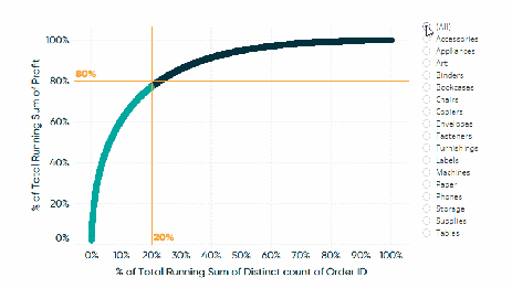

Tableau Training on
Tap Fast Track

Tableau Advanced Analyst

Tableau
Foundation

