Here, Dawn Harrington discusses the most effective visualisations for displaying anomalies in data. The article suggests that a plain scatter plot is a good starting point for representing outliers in your data. Additionally, it introduces other methods like Bollinger Bands and Year Over Year Visualisations to display Key Performance Indicators (KPI’s) in a dashboard. She provides tips on Tableau optimisation and creating different types of charts like Waterfall Charts. A great comprehensive guide to choosing and creating suitable visualisations for different data sets and objectives.
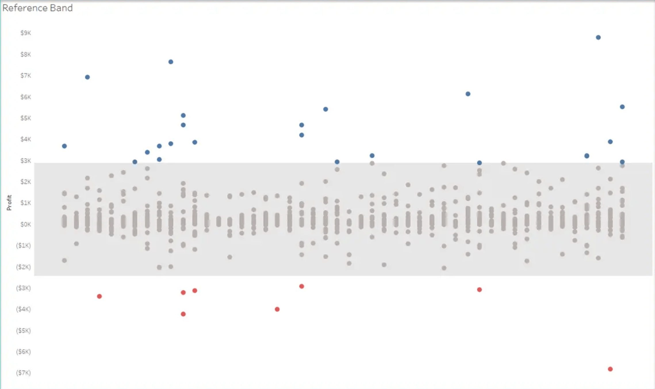

Tableau Training on
Tap Fast Track

Tableau Advanced Analyst

Tableau
Foundation

