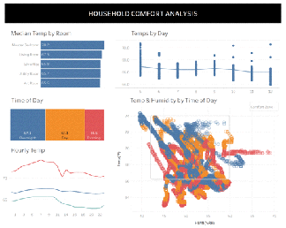
Color is often cited as one of the hardest pieces to master in Tableau design. There’s a reason: conventional wisdom and trainings fail to be explicit enough. Believe it or not, there is a way to use color effectively without all the headaches.Tableau has already done a ton of color science work, from creating color palettes that are balanced to developing diverging palettes that work with our ability to discern color variance. It’s not for lack of color…it’s often that’s there’s too much of it. Worse, many of us have been trained to think about color all wrong.
5 Secrets to Improve Color Use in your Dashboards By Bridget Winds Cogley
Want to Get Latest Updates and Tips on Tableau Bites Blogs
Sign Up For Newsletter


