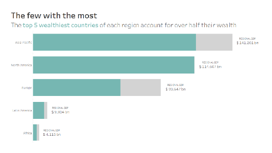
So there I was: a cup of tea in one hand, a mouse in the other, sat in front of the latest Makeover Monday with some apprehension. ‘Global Wealth by Country’, sitting pretty with just 3 fields, seemed deceptively simple. Nonetheless, I had a hypothesis: the top 5 countries in each of the specified regions account for a significant
proportion of that region’s wealth.It’s worth prefacing this post with the fact that my example is bad. To kick things off, the dataset provided for Week 7 seemed inconsistent in its grouping of countries by region (‘India’ and ‘China’ had their own regional category, for example, which were ultimately integrated into ‘Asia-Pacific’ for ease of use). Going forward, I’d probably scrap regional considerations altogether, and focus on comparisons on the country level.
Bar Charts: Colour-Coding the Top X using the Index Function By Jess Hancock
Want to Get Latest Updates and Tips on Tableau Bites Blogs
Sign Up For Newsletter


