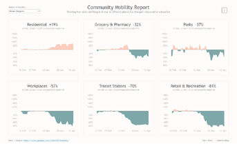
Recently, Google started publishing a series of “COVID-19 Community Mobility Reports” that show movement trends of people over time across different categories of
places based on anonymised mobile data. Originally these reports were published as PDF files only whereby you could search for a particular country and then open and
download a PDF report for that country. However, in the last few days I noticed they were also publishing the CSV data that is used to produce the reports, which opened up the possibility to recreate or add on additional data if needed to build your own visualisations.
Creating Two Colour Area Charts By Marc Reid
Want to Get Latest Updates and Tips on Tableau Bites Blogs
Sign Up For Newsletter


