This blog post by Marc Reid (on DataViz) provides a step-by-step guide on how to create dashed and dotted lines in Tableau, a technique that can help enhance the readability and aesthetic appeal of your data visualisations. By incorporating these techniques, you can make your Tableau dashboards more engaging and easier to interpret.
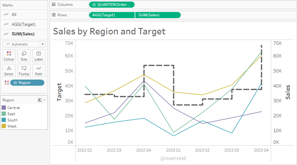

Tableau Training on
Tap Fast Track

Tableau Advanced Analyst

Tableau
Foundation

