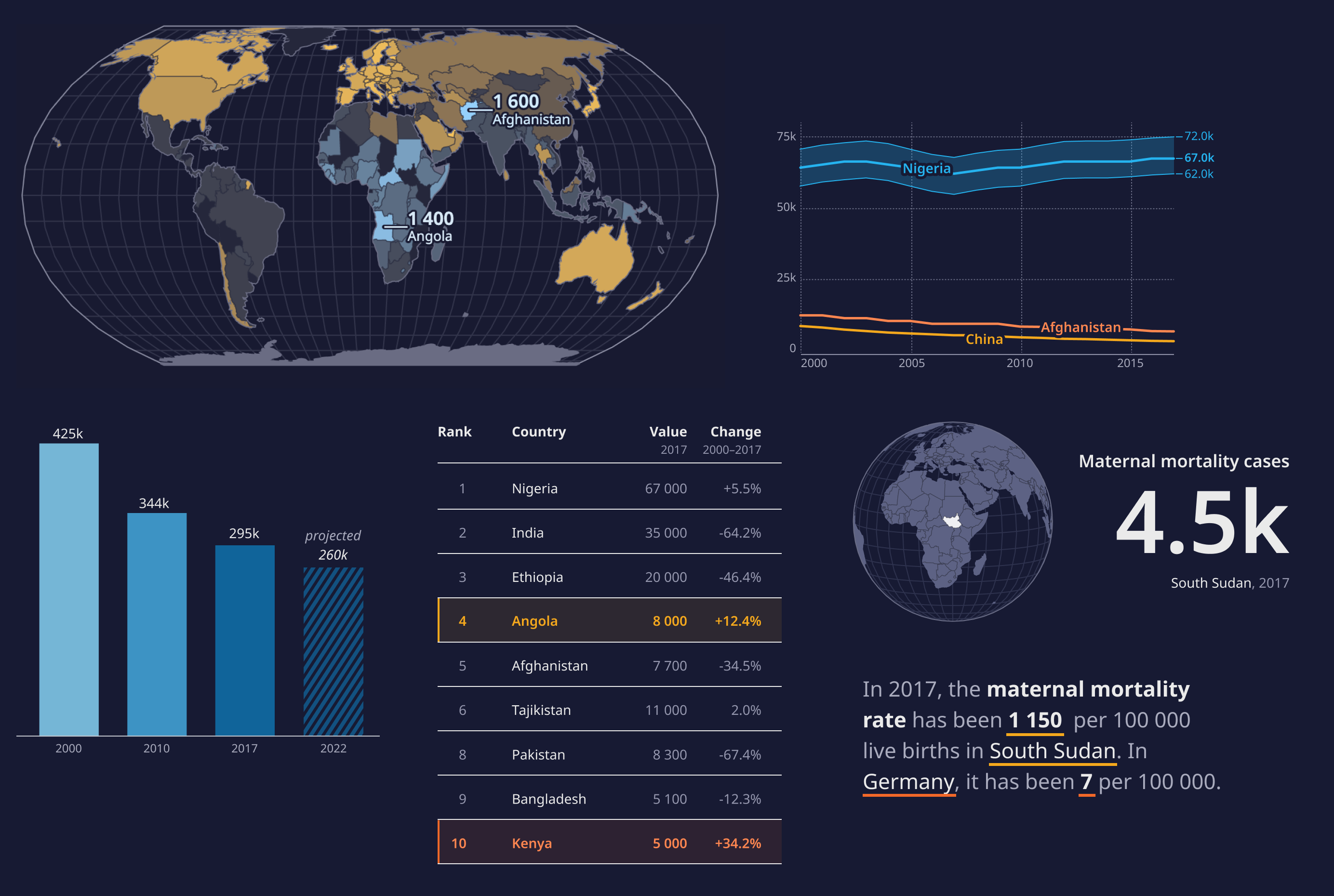
The World Health Organization (WHO) has created a comprehensive guide on design language for data presentation. The guide emphasises the importance of design to effectively communicate health data to users. It highlights that good design doesn’t merely beautify content but also enhances understanding, aids interpretation and facilitates decision-making. The WHO underlines the need for a consistent design language across their data products to ensure clarity and coherence.
The guide delves into various elements of design language such as typography, colours, icons, and spatial organisation. It suggests the use of typefaces that are legible and accessible across different languages and scripts. The WHO’s guide is a valuable resource for anyone looking to improve their data visualisation skills.


