There are times when I like to see every dimension member represented in a data visualization. For example, scatter plots are a great choice whenever you are wanting to view many
data points in the same space. I’ll also occasionally create a bar chart or histogram with every dimension member, even if it causes a vertical or horizontal scroll bar to appear.
While the “long-tail” insights these charts can provide have value, I tend to focus on the few dimension members causing the biggest impact on the business I’m analyzing. For this
reason, I often show the Top N (i.e. usually Top 5 or Top 10) and group everything else into its own segment. And while I don’t advocate the use of pie charts (here are 3 better
options), I do always say that if you must use them, stick to five slices or fewer including “Other”. This is how you do it.This post will demonstrate how to dynamically display the Top N based on the number of dimension members the end user wants to show and how to group everything else into a segment for “Other”.
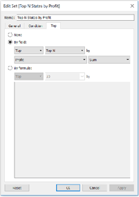

Tableau Training on
Tap Fast Track

Tableau Advanced Analyst

Tableau
Foundation

