As I mentioned in the post, 3 Ways to Make Stunning Scatter Plots, this chart type is already my third favorite for its innate ability to visualize many records
at once, reveal correlations and outliers, and create a natural four-quadrant segmentation. One weakness of scatter plots, however, is that they don’t clearly show how a dimension member’s position is changing over time. Fortunately, Tableau’s flexibility allows us to go way beyond the defaults and Show Me options, and this in case, will help us literally connect the dots on a scatter plot.
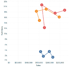

Tableau Training on
Tap Fast Track

Tableau Advanced Analyst

Tableau
Foundation