Leapfrog charts are a variation on a minimalist dot plot and can be used when the primary objective is to show the relative performance of a specific dimension member to a comparison point or points – or what it would take for that dimension member to ‘leapfrog’ over another, if you will. The dot plot is combined with a Gantt chart to illustrate the difference between a selected dimension member and a specific target or the average, median, minimum, or maximum for a measure across the business.
This chart was developed in conjunction with Playfair Data Information Designer, Jason Penrod. Keep reading to see how the chart looks and learn how to make it!
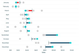

Tableau Training on
Tap Fast Track

Tableau Advanced Analyst

Tableau
Foundation