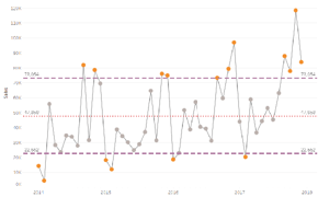
If you are here it is because you either already know how to create a Control Chart in Tableau or have followed from my previous blog on that subject and now want to find out how to take your Control Chart to the next level.In this post I will show you how to use a calculated set of control limits to highlight outliers, also how to give your end users a level of control over the extent of the control limits applied. If you don’t know how to create your calculated control limits please check out my earlier blog post – Control Charts in Tableau.To follow the rest of this blog you will need to have created your Control Chart with calculated fields rather than drag and drop from the Analytics Pane – if not please follow my previous blog post on how to do this.
Pimp your Tableau Control Charts By Chris Dickson
Want to Get Latest Updates and Tips on Tableau Bites Blogs
Sign Up For Newsletter