There are a lot of helpful hints on modifying desktop dashboards into mobile ones. They tend to focus on altering the layout to be tall and being mindful of finger-based interactions. I feel they forget one critical aspect – users don’t actually want to look at dashboards on a mobile device. Now with that blasphemous statement out of the way, let’s get on to what users on mobile do want, an analytics app that serves up relevant content that is engaging, useful, and quick to digest on the go.
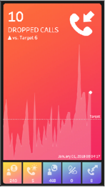
I seem to be in a mood about making the traditional KPI dashboard a bit more modern as well as increase the value to the end user by aiding the understanding of what is critical. If you haven’t already checked out the post on lighting, please do. It focused on lighting effects to draw the users eye to what is critical based on the impact of a KPI’s deviation from a target. In this post, we play with a KPI’s position on a “mobile app” as another method to assist the user in focusing on what is important now!
Feeding the screen-time beast with shifting mobile metrics By Anya A’Hearn
Want to Get Latest Updates and Tips on Tableau Bites Blogs
Sign Up For Newsletter