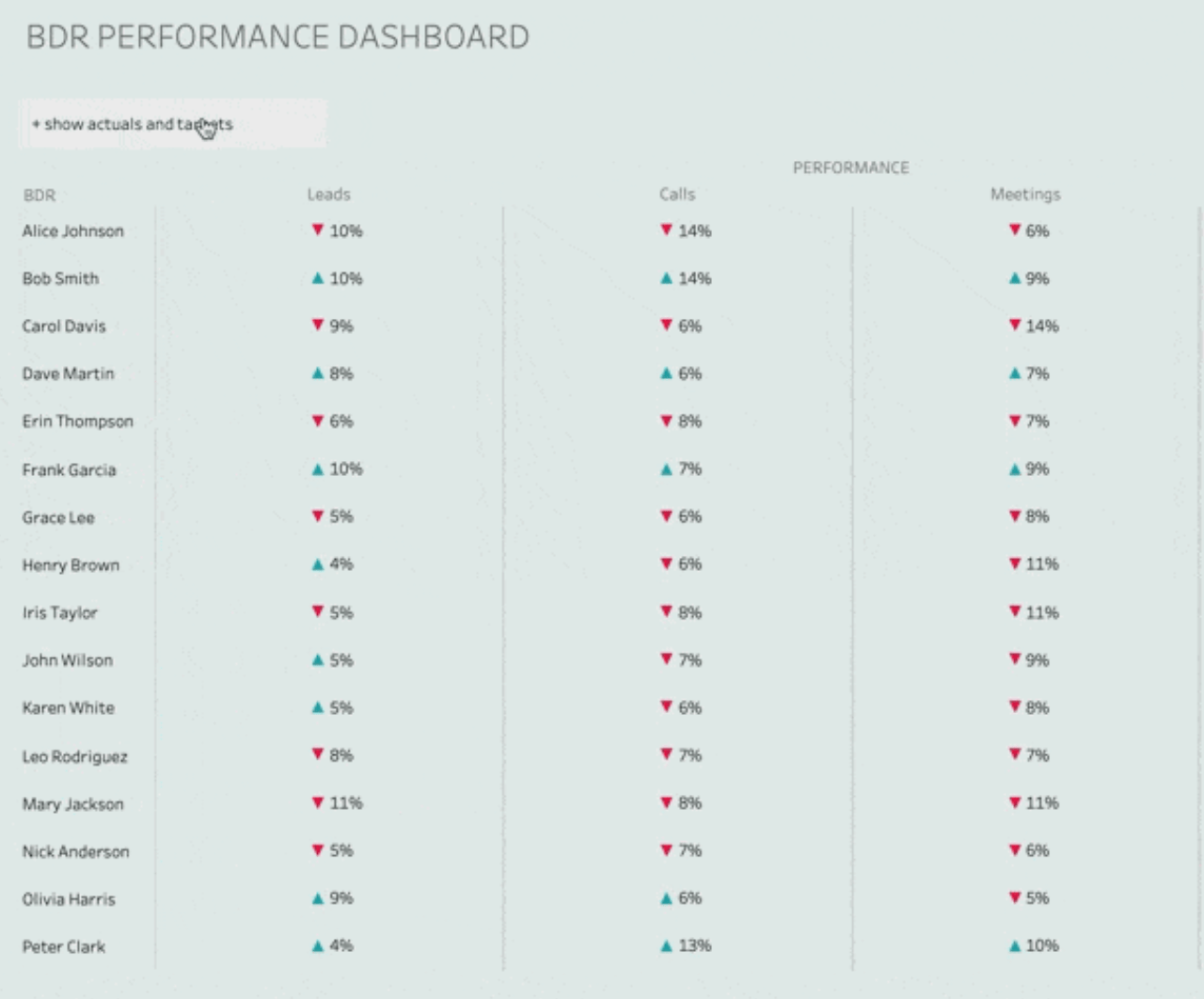
Tables are the backbone of data visualisation. Not only is it often the framework we use to structure our data before we bring it into our platform of choice, it can be a really impactful layout to show data to the end user.
Here, Autumn Battani explores how to make the most out of your data visualisations, with tips on how to structure your data in a way that makes it easier to understand and interpret. With these helpful hints, you’ll be able to take your data visualisations from boring to brilliant. So don’t wait any longer – start reading today…


